

Mastering image alt text isn't just HTML compliance; it gives every visitor the experience your visuals intended, but you've gotta do it right.
Your guided tour
Imagine walking through the dimly lit halls of an art museum. You’ve been looking forward to this visit for weeks, but unfortunately just before coming you went to the optomotrist, and since your pupils are still dilated you’ve got heavy sunglasses on.
Normally you’d take in the art visually, but today you can just barely make out the shadowy figures of the art on the wall. Still, you’re determined to enjoy the trip, so you ask one of the museum’s docents to accompany you today. You stop before a captivating canvas, perhaps Turner’s Sunrise with Sea Monsters. Since you cannot see the canvas very well for yourself, your entire experience hinges on the voice of the docent at your side.
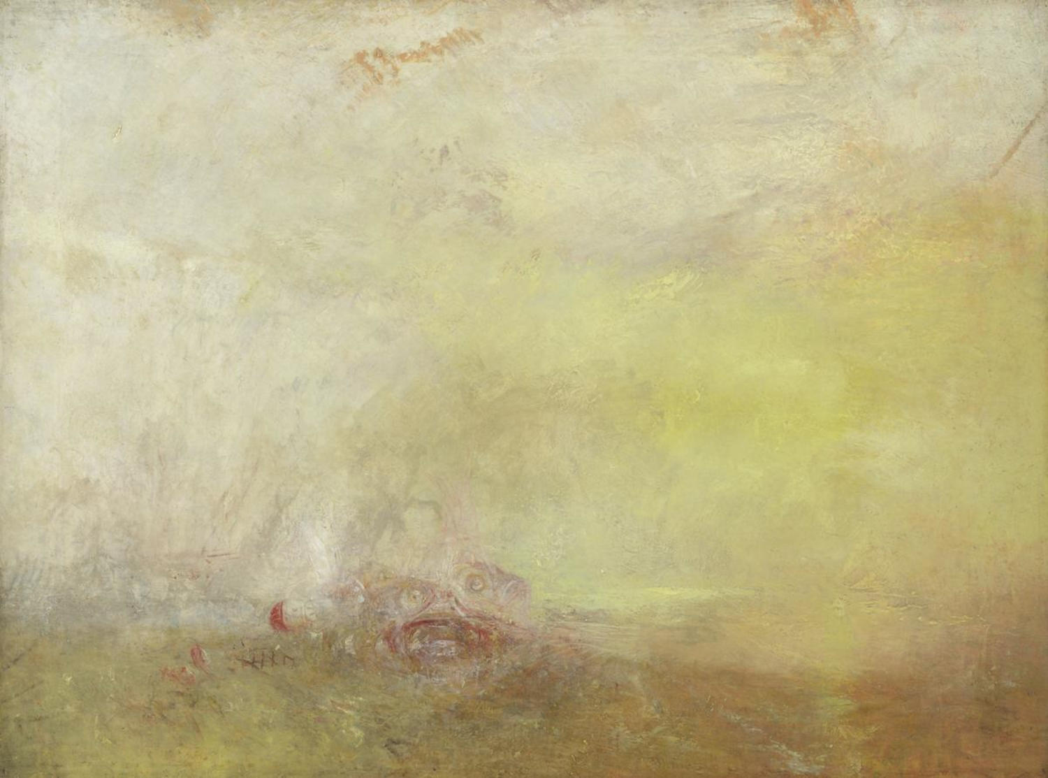
A poor docent simply states the obvious: "This is a rectangular painting in a wooden frame." A pedantic docent rambles for twenty minutes about every brushstroke, boring you to tears before you even reach the next gallery. But the brilliant docent at your side? She captures the essence of the piece in a few well-chosen sentences.
She tells you about the churning violent sea, the streak of fire against dark iron, and the overwhelming sense of speed. She gives you the exact context you need to feel what the artist intended you to feel, and then she gracefully steps aside so you can enjoy the rest of the tour.
As content creators, web developers, and site owners, every page we publish is a digital gallery. And every time we insert an image onto the web, we take on the mantle of the docent. The alternative text, or "alt text", we write is our spoken tour for visitors navigating via screen readers or low-bandwidth connections.
Yet, despite being essential to many people’s experience of the web, alt text remains one of the most misunderstood aspects of digital content. Let us examine how to step up as proper docents for our readers, bridging the sensory gap with clarity, efficiency, and respect.
Image Alt Primer
Image alternative text is set as an attribute right on an html IMG element. It’s not separate, but built in as part of that element’s html DNA. Just as you can’t have an image on the web without a source (the file that it displays as the image) you similarly can’t have an image on the web without a text alternative. Leave it out, and it’s invalid html. That’s how essential alt text is.
✅ Correct Syntax
Includes both the required source (src) and accessible alternative text (alt).
<img src="/good-example.jpg" alt="throngs of rejoycing people jumping up and down and pumping their fists in the air"/>❌ Missing src Attribute
Without a source file, the image cannot load or render on the page.
<img alt="throngs of rejoycing people jumping up and down and pumping their fists in the air"/>❌ Missing alt Attribute
Omitting alt text leaves screen readers stranded and results in invalid HTML.
<img src="/good-example.jpg"/>On the other hand, the alternative text doesn’t necessarily have to be filled out. There are times when you’ll want to leave the alt attribute blank, but the attribute itself needs to be there. We’ll get to times you might leave it blank later, but most often you will fill it. Depending on the purpose of the image, you’ll fill the alt with a variety of things accomplishing different purposes to match the image purpose.
What’s an image for?
The purpose of your alt text is to create the same response in its reader as your image creates in its viewer. In order to do this, you need to consider what the image is there to do. Images can serve several purposes.
Illustrative
We most often think of images as being illustrative. If the text of the page is trying to convey some point, an image might go along with it as illustration to clarify the point or make sure that it’s understood. This is probably a nod to Gardner’s theory of multiple intelligences. Even before he did his research and formulated the theory, though, everyone naturally intuited that giving information to someone in two different ways was better than in just a single way.
...it is better to teach in two ways than in one...
An image is a great second way to get your audience your information, but then the question arises: what if someone can’t actually see the image? That’s where descriptive alt text steps in. Sighted visitors use visual cues to construct what Gardner terms not merely 'visual,' but ‘spatial’ mental models of an image. Gardner knew that non-sighted visitors construct those exact same models using words. For illustrative images, good alt text bridges that sensory gap by focusing directly on the spatial details that convey your core point.
Functional
Often images on the web serve a functional purpose. An image may be a link that takes you to a new page. Or it may be a button that performs an action within the same page. In both of these instances, the alt text is especially important.
Without alt text, someone on a screen reader navigating to an image-link may hear just, “link” rather than “link, SeaMonster Studios home”. An empty link doesn’t give any indication of where it will go or what it will do, which is problematic. Leaving the alt attribute blank on an image-link is what I would call a critical accessibility violation because it blocks a screen-reader user’s ability to know what they’d be getting into by following the link.
Impactful
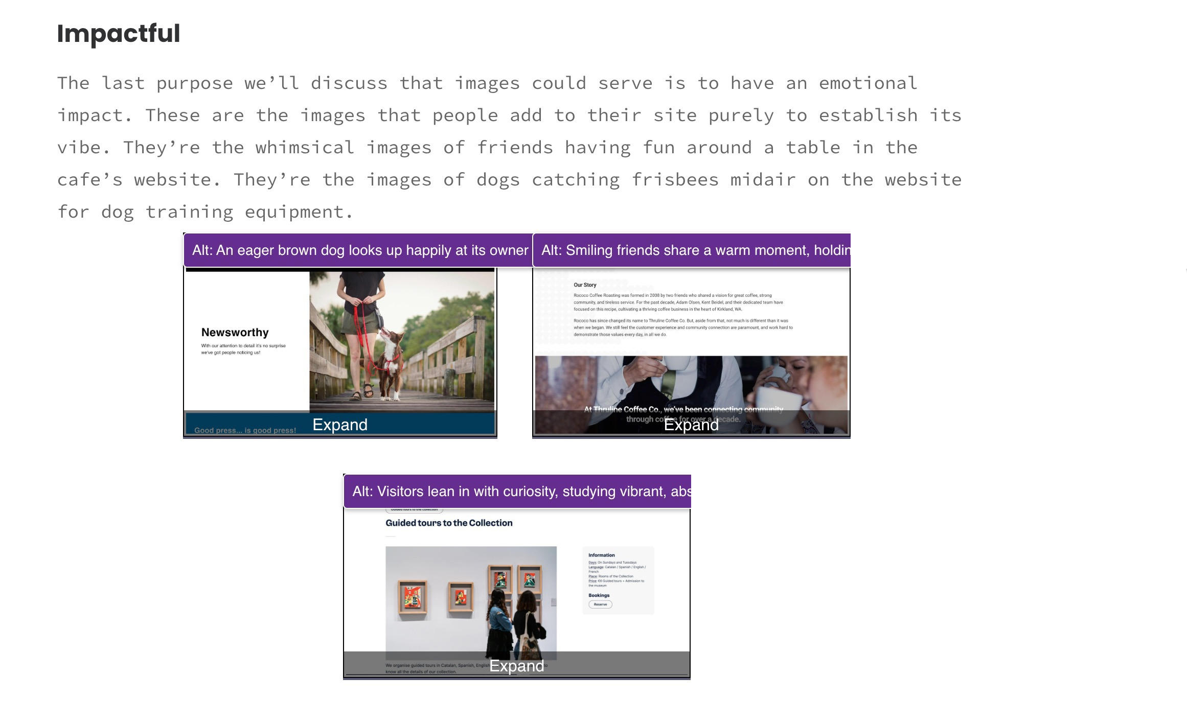
The last purpose we’ll discuss that images could serve is to have an emotional impact. These are the images that people add to their site purely to establish its vibe. They’re the whimsical images of friends having fun around a table in the cafe’s website. They’re the images of dogs catching frisbees midair on the website for dog training equipment.
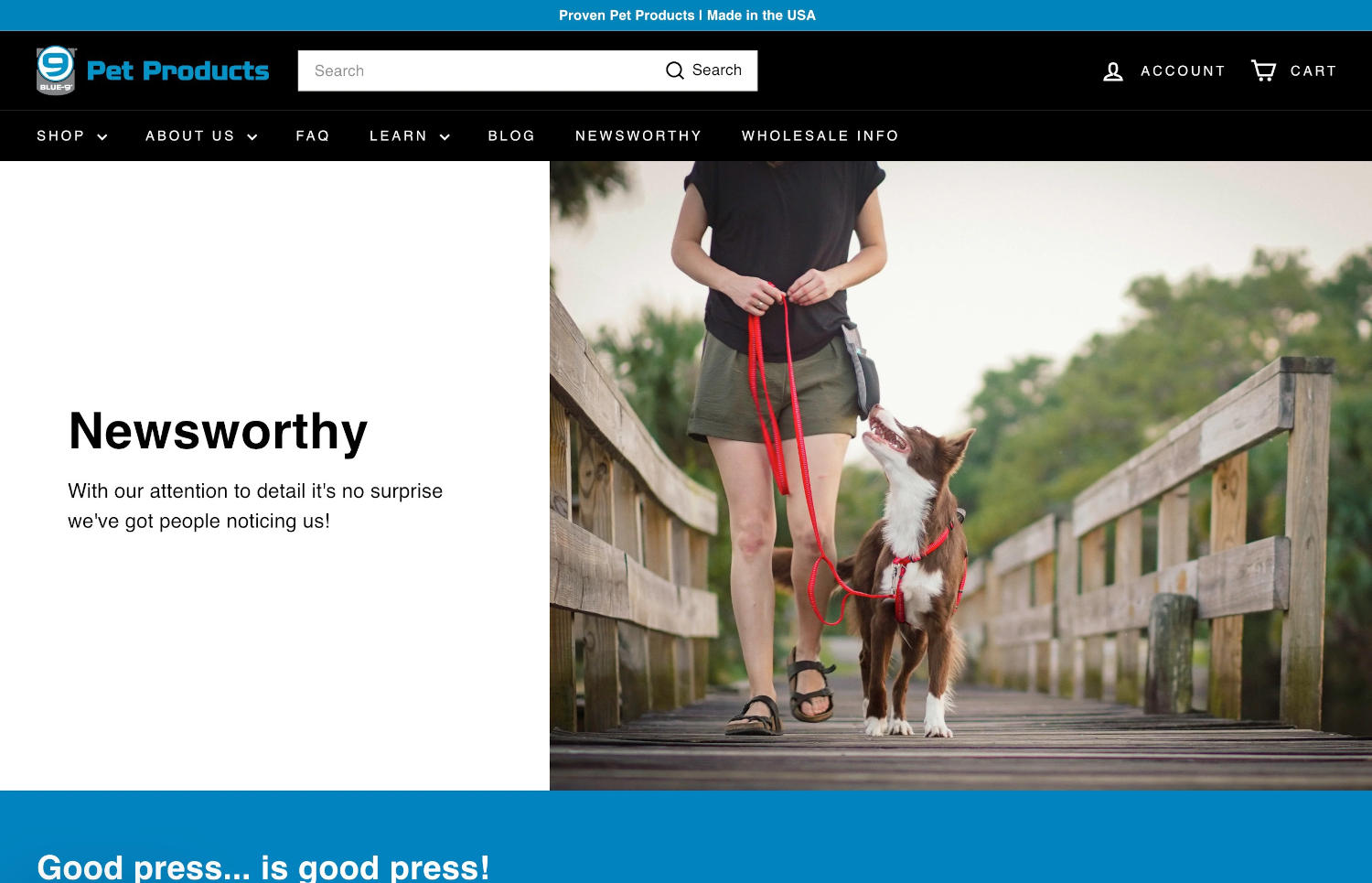
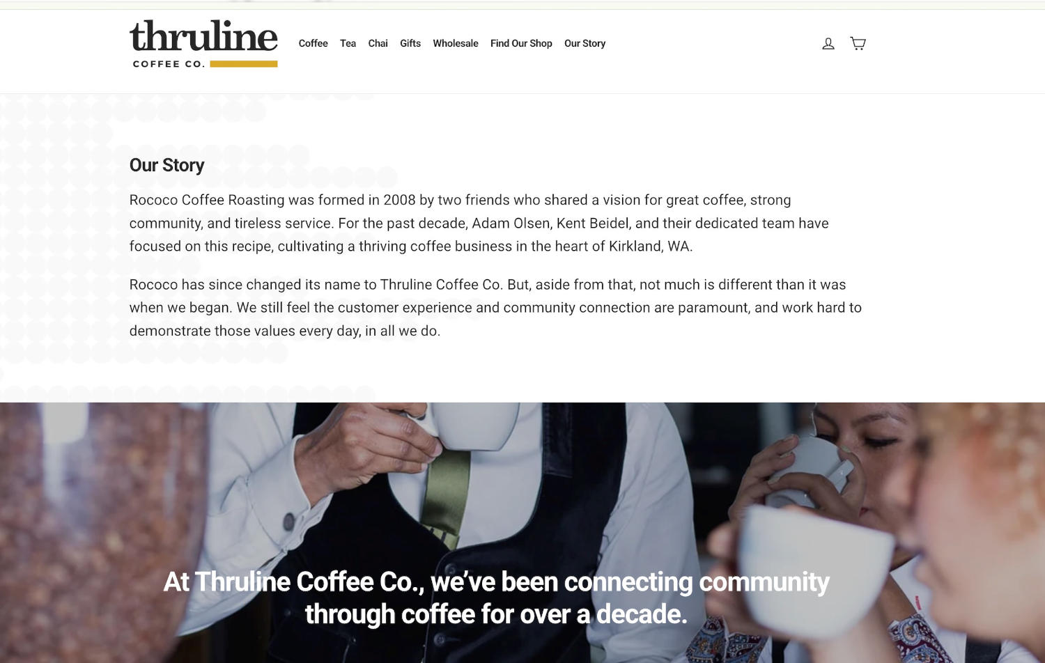
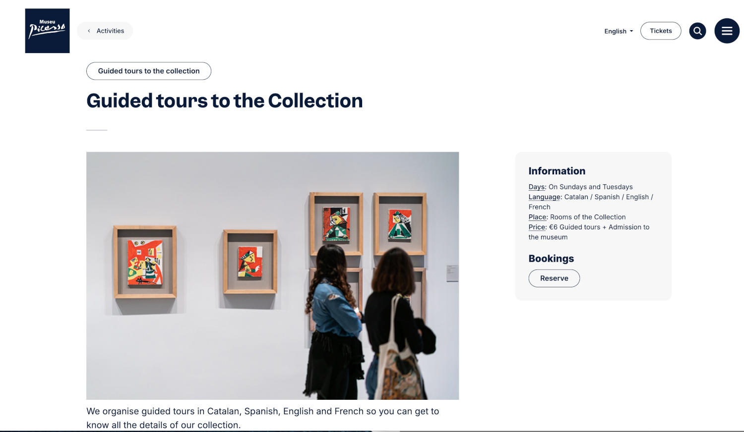
Impactful images don’t directly illustrate anything contentful about the company whose website it is. Instead, they contribute to the feel of the site, and I’d argue that in this role, they are still important. My assertion is that if a site image was chosen to have an impact on the visitors who come to the website through a graphical web browser, the alt text for that image should be carefully constructed to have the same effect on someone who experiences the site auditorially through a screen reader.
How to write appropriate alt text
Now you’ve decided to compose appropriate alt text for all your illustrative, functional, and impactful images, you probably need a few rules to follow when composing it so you can be sure you’re doing it well. Start out by considering these parameters:
How much to say (length)
The standard length recommendation for alt text for the past number of years has always been 125 characters. This recommendation was originally based on the erroneous assumption that screen readers cut alt text off after that point, which was actually never the case. Even though the reasoning was always erroneous, I still find this a pretty good guideline for alt text.
When sighted people glance at images, it only takes them a fraction of a second to take in a great number of bits of information about the images. If visitors can’t see the images, however, and need to get their information about them by listening to the alt text, that information will come much more slowly: word by word and character by character. To strike a comfortable balance between speed and information, I think 125 characters (about 80% as long as a standard text message) is about right.
This text is exactly 125 characters long. It is okay if you have less, or a little more, but just this much is about perfect.
At a screen reader's default speed, 125 characters takes roughly 6 to 8 seconds to read, pushing right against the upper limit of user patience. According to Nielsen Norman Group's attention research, the first 10 seconds of a page visit are critical for deciding whether to stay or leave, so spending 6 to 8 seconds on a single image description consumes nearly that entire attention window. Fortunately, experienced screen reader users typically listen at accelerated speeds, bringing that read time down to a far more efficient 2 to 3 seconds.
What not to say (omissions)
In order to economize reading time, when writing alt text you should always omit such words as “image of”, or “picture of”. When screen readers announce images to their users, they identify what kind of element it is (in this case, an image) so putting that into the alt text would make for a needless repetition and just increase the reading time without adding any value to the understanding of the image.
Instead, just launch right into the description of the image or its function, for example “dog leaping in the air to catch a frisby,” or “Blue-9 Pet Products home”.
What order to say it in
Because many screen reader users are so proficient at their tools, and value their time as much as anyone else, often when they can tell it’s an image being read to them, they’ll skip on to the next element once they’ve got the gist of the image, potentially losing the last half or more of your meticulously composed alternative text.
Because of this, you should always craft your alt text to follow an order of decreasing importance. That is to say, you should start the alt with the most important description, and add details that are less and less essential after it. That way, screen reader users can get the gist of the image after the first three or four words, but get more and more details the longer they’re willing to listen.
Consider the context
Whenever possible, you should compose the alt text for your images as soon after selecting them as you can. This is because you’ve probably spent a fair amount of time choosing an image to achieve certain purposes with your visitors. You chose the image to illustrate your point just right, or to encourage your visitors to activate a function, or to have a particular emotional impact on them.
As quickly after you’ve chosen your image as possible, you should come up with your image alt, so that all of that context is still fresh in your mind. This is your greatest opportunity to actually achieve your goals. Ideally, you should compose the alt quickly after selecting the image, but hopefully that’s not the last time you consider it.
Once your page launches with all its images and alt, go back over it with images turned off in your browser. When you turn images off in Chrome or Firefox, rather than your image it’ll show your alt text. Read through your page and consider whether your alt still accomplishes your goals for the images.
When to leave alt off
Truly decorative images may be pure flourishes, line dividers, or redundant icons that add zero context or emotion. These should use an empty alt attribute (alt=""). This tells screen readers to skip the element cleanly. (Note: alt="" is valid HTML, whereas omitting the alt attribute entirely is a validation error.)
This brings us to a spirited debate in the accessibility world. Experts like Emma Cionca at Nielsen Norman Group argue that describing non-essential visuals wastes screen-reader users' time and attention. I respect that efficiency-first mindset, but my personal philosophy leans more towards equity: if an image was intentionally chosen to convey a vibe or feeling to sighted visitors, hiding it completely feels like deciding for non-sighted readers what they get to experience.
My rule of thumb: Use alt="" for redundant or purely structural graphics. But if an image adds flavor, mood, or context beyond what’s captured in the surrounding copy, give it a tight, front-loaded description and let screen-reader users decide for themselves whether to listen to it all or skip.
When alt is particularly needed
While I diverge from Cionca’s view somewhat on the number of images that should be marked decorative, I fully agree with her list of times when alt is absolutely needed. She says that if it adds new content, if it’s referenced in the text (ie, “notice in the image that…”), or if it helps the visitors accomplish their tasks in more efficient ways, then alt text should definitely be included.
Can’t AI do it for me?
If you’ve been following our Robot series here at SeaMonster Studios, and particularly if you read our last installment of Quick & Dirty content creation on AI’s abilities, you’re probably wondering: Can’t we just let AI handle this? E-commerce platforms like Shopify already offer built-in AI alt generators, so why not automate it?
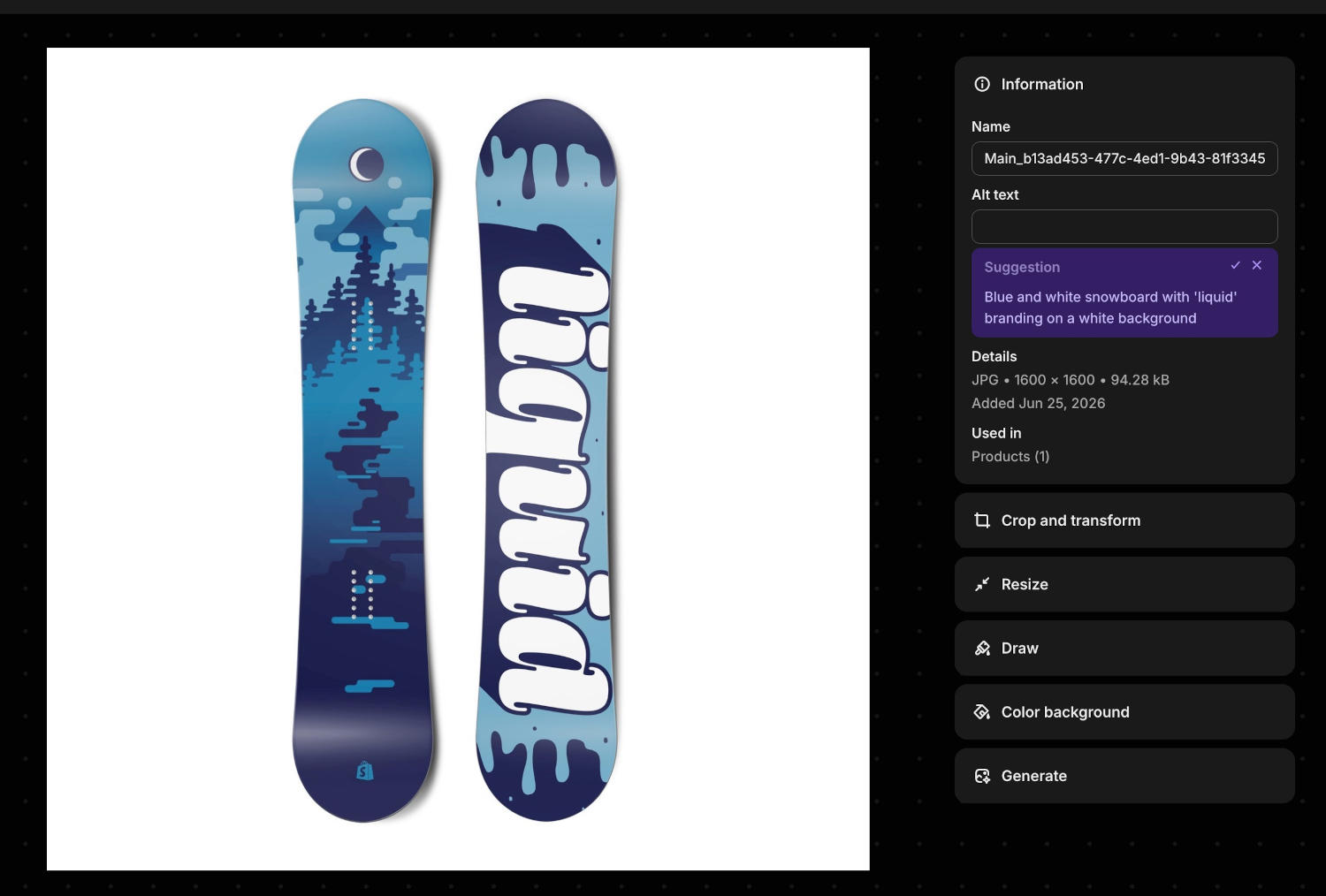
Can't it? Not quite.
The short answer: AI makes a great assistant, but a terrible sole author.
Modern vision-language models have come a long way. They are remarkably fast and adept at baseline descriptions, and if given clear parameters (like staying under 125 characters), they follow instructions well.
However, unassisted AI falls short in three critical areas:
- No Context: The model generally doesn't know the surrounding article or how the image supports your written narrative.
- No Intention: It can't guess why you selected a particular photo or what emotional response you want to evoke.
- No Filter for Flawed Training: Since AI models are trained on the web's existing alt text, which is often stuffed with keywords or lazily written, unguided AI often reproduces those bad habits.
Can’t it? Perhaps with a balanced approach.
You’ll recall that I said just a few sections ago that there are ways that AI can help, which is true. In looking for its help, though, you’d do well to consider it in the right light: help you it can. Do it for you it cannot. You need to find the right balance between writing all your alt yourself, and having AI do it all for you.
The right balance
Much like my final conclusion in On the AI Takeover, back in 2023, I think AI should only be trusted to draft potential alt text for images, but that this alt should be vetted, considered, modified, and finally approved by a real human, ideally the one who created the content the image is used to illustrate, functionalize, or give impact to.
To that end, my recommendation is threefold:
- Include clear instructions for the AI on how you want the alt composed.
- Ask for several options of alt that you can choose between, depending on the image’s context and intent.
- Tweak and polish your chosen alt before using it directly.
I believe if you follow these recommendations, you will be able to use AI well to power more quickly through composing alternative text for your images while at the same time making sure you're giving your visitors the docent-at-the-side experience that will really make your site stand out.