Step One: Focus Indicator
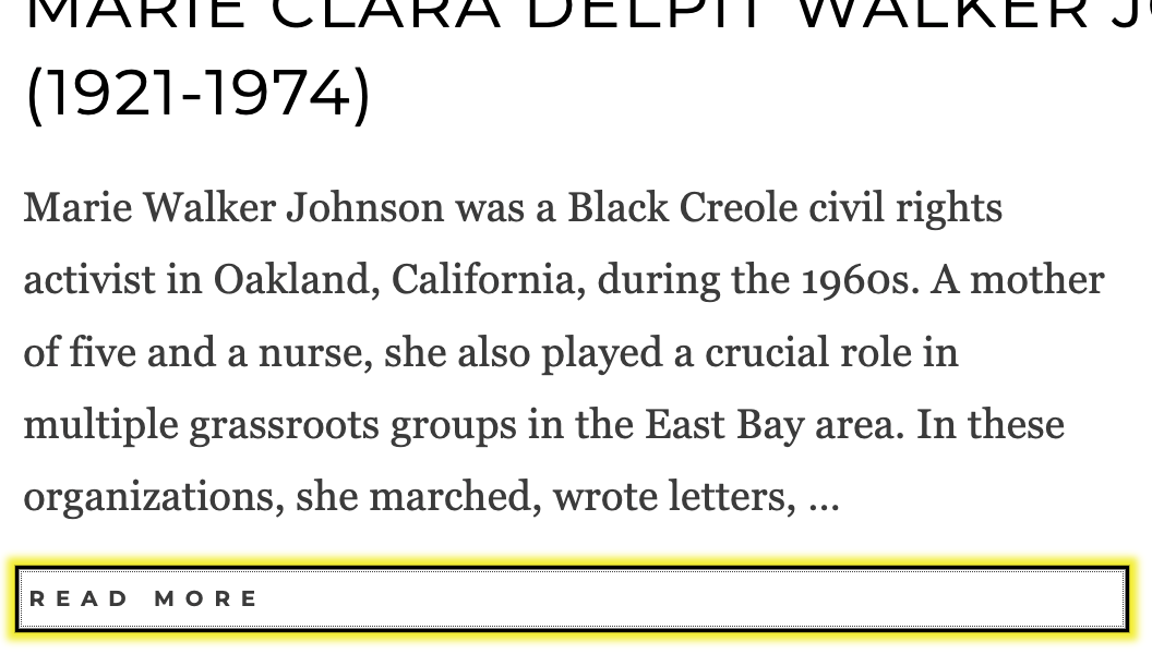
Originally, BlackPast’s site used a wide variety of strategies to indicate focus (showing keyboard users which element they’ve selected). While the intention was to design every focus indicator beautifully, in practice a lot of elements were just left out, haivng no focus indicator at all. To fix this, we put in a flashy two-tone focus indicator that is clearly apparent to visitors navigating by keyboard.
To give a consistent and attention-drawing indicator to those who need it, we designed a flashy, brand-consistent focus indicator only visible to the keyboard users who use it.
2.4.7 Focus Visible (Level A)
Any keyboard operable user interface has a mode of operation where the keyboard focus indicator is visible.
Before: Indistinct Focus
By design, links had a focus style, but it wasn’t very apparent

After: Obvious Focus
New style is bright, flashy, and bold for those who use it

Next Up: An Accessible Menu
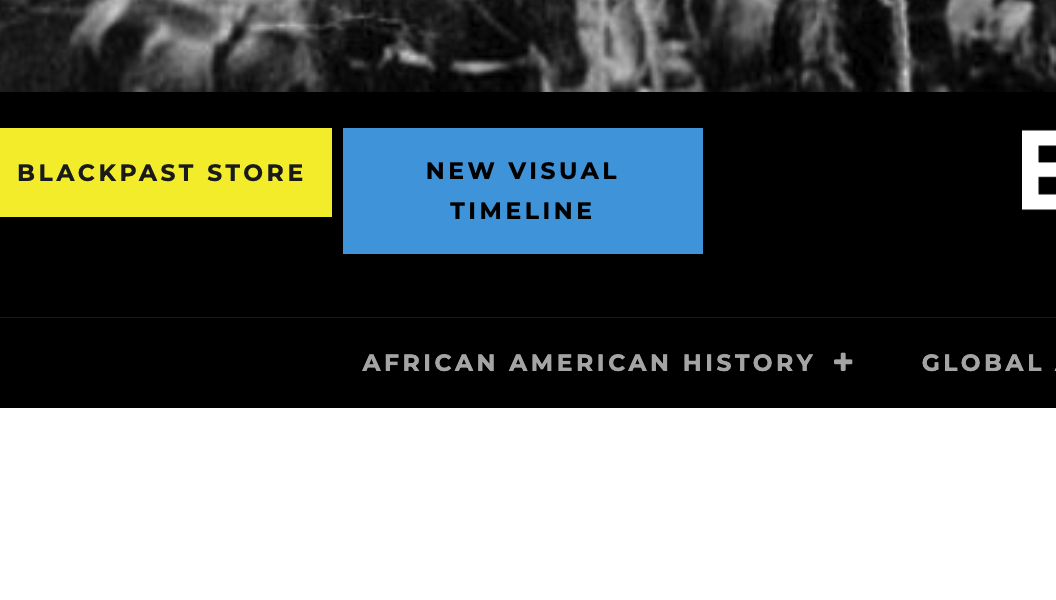
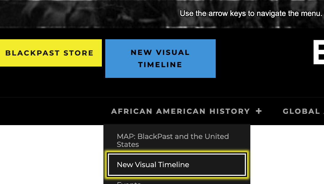
BlackPast’s menu was sort of accessible in that a keyboard-navigating visitor could tab through the entire thing and follow any link inside it. The dropdown menu items wouldn’t drop down, however, so for sighted visitors had a difficult time knowing what they were selecting. We fixed the styles so the menus would drop down when needed, and made the menu even more usable by installing our Crow’s Nest plugin which enables navigation of the menu with they keyboard arrow keys. This makes it so that a keyboard user could get to even the most deeply embedded option with seventeen keypresses rather than seventy as originally.
Success Criterion 2.4.5 Multiple Ways (Level AA)
More than one way is available to locate a Web page within a set of Web pages except where the Web Page is the result of, or a step in, a process.
Before: Menu Invisibility
No drop downs for keyboard users meant only invisible access to secondary links

After: Ease Enabling
Visual access to all menu items, with added ability to navigate with arrow keys

Communicating Accessibility
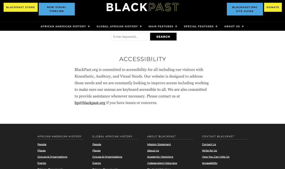
BlackPast initially had no accessibility statement declaring its intention to serve all visitors. With advice from SeaMonster Studios, and our blog post on the accessibility statements, BlackPast’s Executive Director wrote an accessibility statement that we made apparent in the site.
Guidance from W3C
Accessibility statements are important for several reasons, [among which, to] show your users that you care about accessibility and about them.
After: Personable Connection
Warm statement making clear how BlackPast feels about accessibility

BlackPast
BlackPast, one of the largest sources of information on black history on the internet, gets millions of visits per year. As an organization it is deeply committed to equity and making its information available to all people, so when we approached them about making their site more accessible, they were excited by the prospect.
ClientBlackPastServicesAccessibility Services, WCAG ComplianceYear2022
