Interactive = the mind groups according to past interactions
Forms
Sliders (ignore)
Videos (consider whether to play)
Accordions, tabs, etc, sort of like headings
Native Screen Reader Experience - 1
Goal is the same: figure out if we want to spend time on this site
Screen reader strategies
Crank the reading speed way up
Jump through the structures of the site
Only listen to enough of each element (image alts, headings, etc) as needed to get the gist
Etc (Kosi fill in)
Visual Surfer Experience - 2
Informative vs Interactive elements
Informative = get info as quickly as possible
Headings
Images
Pull quotes
Interactive = the mind groups according to past interactions
Forms
Sliders (ignore)
Videos (consider whether to play)
Accordions, tabs, etc, sort of like headings
Screen Reader Learner's Approach
In order to be able to approximate a native screen reader user’s experience, you need to at least become very comfortable with screen readers, how they work, and how they sound
Practice, practice, practice!
At first, guided practice is very helpful
Introducing the Screen Reader Ropes Course!
Ultimate goal is some level of fluency with screen readers
On the path to fluency
Nonnative screen reader development
Getting Started - 2-5 hours
Functional Beginner (know the strokes) - 10-20 hour*
Intermediate (more comfortable) - 40-60 hours*
Proficient (strokes are second-nature) - 100-250 hours*
Native fluency (Lived expertise through full-time use)- 2000+ hours*
* practice hours should all be spent with screen curtain on, eyes closed, or not looking at the screen. Kosi insists!
Make sure to apply Kosi’s Screen Reader Native Approach
Native Screen Reader Surfers' Experience
Initial Arrival
Exploring Structure
Taking Stock
Moving Through and Interaction
Questions, Achievements, Themes
First Impressions – My Initial Arrival
Hearing the Title: The very first thing my screen reader tells me is the page title. This gives me my initial clue about what the page is about.
Dealing with Immediate Announcements: Sometimes, I immediately hear alerts like cookie notices or modal windows asking me to sign up for something. I have to address these first.
Confirmation of Loading: My screen reader then usually says "Document" or "Page loaded," letting me know the content is there.
Starting at the Top: My screen reader's focus is automatically at the very beginning of the page.
Getting My Bearings – Exploring Structure
Jumping Through Headings: I immediately start using my heading navigation commands (like pressing "H"). This gives me a quick outline of the page's main sections and how the information is organized.
Finding the Landmarks: I also navigate by landmarks (using "R" or my screen reader's landmark navigation). This helps me quickly locate the main navigation, the main content area, and the footer.
Taking Stock – What's on the Page?
Listing the Links: One of the first things I often do is bring up a list of all the links. This tells me where I can go on this page and what other sections exist. Clear link text is vital here.
Checking the Buttons: I also look at the list of buttons to see what actions I can perform. Well-labeled buttons are essential.
Identifying Form Fields: If I suspect there's a form, I'll check for a list of text fields, checkboxes, and dropdowns.
Exploring Lists: I'll see what lists are on the page and consider delving into them later.
Reviewing Headings Again: Sometimes, a list of headings provides a clearer overview than just jumping through them.
Moving Through the Content
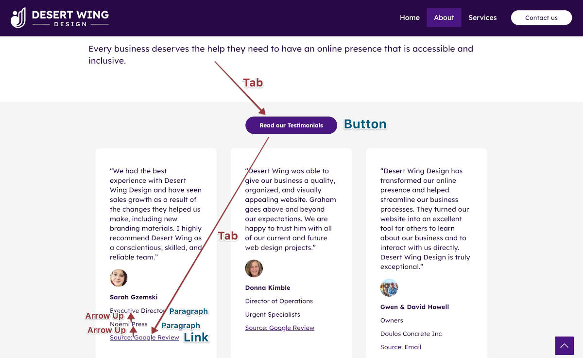
Tabbing Through: I use the Tab key to go through all the interactive elements in order. This helps me understand the flow and make sure everything is reachable with the keyboard.
Reading Line by Line: If the structure is confusing or I need to understand the details, I'll use the arrow keys to read the content word by word or line by line.
Listening to Element Types: My screen reader tells me what kind of element I'm on – a link, a button, an image, etc.
Paying Attention to Labels and Alt Text: I really rely on the labels for form fields and the alternative text for images to understand what they are.
Getting Things Done – Interaction
Using the Keyboard: I use Enter to click links and buttons, Spacebar for checkboxes, and type into text fields.
Looking for Feedback: After I do something, I listen carefully for any messages that tell me if it worked, if there were errors, or if something changed on the page.
Navigating Complex Parts: For things like tabs or expanding sections, I try to figure out the keyboard commands, hoping the website uses accessibility standards.
Questions I'm Always Asking Myself
What's this page about?
What are the main parts of this page?
Where can I go from here?
What can I do on this page?
How is the information organized?
How do I move through the interactive parts?
What information do I need to put in this form?
What's this image showing me?
Did that button click work?
Is this website making sense to me?
What I'm Trying to Achieve
To understand the purpose and content.
To find my way around and know what I can do.
To get a mental picture of how things are laid out.
To be able to interact with elements and complete tasks.
Ultimately, to have a usable and efficient experience.
Common Themes in My Web Surfing
Structure is Key: If a website is well-structured with headings and landmarks, it's much easier for me.
Words Matter: Clear labels and good alt text make a huge difference.
Keyboard is Everything: I can't see the mouse, so keyboard navigation has to work.
I Need to Know What Happened: Feedback after I interact with something is vital.
Accessibility Makes or Breaks It: How easy a website is for me depends directly on how accessible it's been designed.
I'm Always Problem-Solving: I often have to figure out unconventional layouts or poorly implemented features.
Screen Reader Tips
Kosi's Contextualizing Tips
Turn Off the Screen & Rely on Audio
Embrace Keyboard-Only Navigation
Build a Mental Map Using Headings and Landmarks
Browse Mode vs Forms Mode
Develop Patience and Practice Mental Rehearsal
Pay Attention to Dynamic Content and Focus Management
Pay Attention (generally)
The Visual/Screen-reader Disconnect
The experiences are different
Embrace the disconnect
You won't ever be native
It's still worth it to test on screen readers
The Visual/Screen-reader Disconnect - 1
Goals are the same
Informative - get the info
Interactive - perform the interactions
The experience is on a different plane
varied fluency = vastly different experience
Paired testing is essential
Variety of pairings is optimal
Every user is different
Embracing the Disconnect
Embrace the disconnect
Chance to tease out the differences
Chance to see the site experience as a whole (different perspective)
Chance to hammer out what would be the optimal experience for both
But what if you don't have a native screen reader user to test the site?
That's why you're here!
Without a native tester
In the absence of a native screen reader paired tester
Realize you're not getting the full picture
Put yourself in the place of a native screen reader user as best you can
It's better than not trying
Every site you test for accessibility you should test with at least one screen reader
Preferably test it with two or more
Know that it's still not the full picture
Imposter Syndrome
“I Don’t Feel Qualified”
Reframing the Role
What Good Testing Looks Like
“I Don’t Feel Qualified”
Some common concerns:
I don’t know enough
I’ll do it wrong
I’m not a screen reader user
Reframing the Role
You are not replacing users
You are:
Identifying barriers
Evaluating structure
Supporting better outcomes
What Good Testing Looks Like
You are:
Thoughtful exploration
Clear documentation
Awareness of limits
When in Doubt: Ask These Questions
Did the screen reader announce what the item is? (e.g., link, heading, button)
Did it tell you what the item is called?
Did it describe what state the item is in (e.g., selected, required, expanded)?
Did anything feel confusing, repetitive, or silent when it shouldn't have?
If you answer "no" to any of those, the page likely has accessibility issues.
From Navigation to Testing + Documentation
Documenting What You Find
Documentation Template
Testing and Documenting Responsibly
Documenting What You Find
Describe:
What the user encounters
What the barrier is
Why it matters
Avoid:
Overstating impact
Understating barriers
Documenting What You Find
Weak documentation:
“Button is unlabeled”
Stronger:
“Screen reader users encounter an unlabeled button and cannot determine its purpose when navigating by controls”
Documentation Template
Barrier:
What the user encounters
Impact:
Why it matters for screen reader users
Context:
Where and when it occurs
Recommendation:
What should be improved
Example Using Template
Barrier:
Unlabeled button
Impact:
Screen reader users cannot determine its purpose
Context:
Occurs when navigating via buttons list
Recommendation:
Add an accessible label describing the button’s function:
When navigating with a screen reader, you should hear:
Role — What is the element? (e.g., button, heading, link)
Name/Label — What is its purpose? (e.g., "Search", "Continue")
State — What condition is it in? (e.g., "selected", "disabled", "checked")
If you're hearing all three (when appropriate), the element is likely coded accessibly.
What Appropriate Screen Reader Output Sounds Like (By Element)
Screen Reader Announcements
Element Type
Expected Announcement
Heading
"Heading level 1, Welcome"
Link
"Link, Contact Us"
Button
"Button, Add to Cart"
Image (with alt text)
"Graphic, Woman walking with cane"
Checkbox
"Checkbox, Subscribe to newsletter, not checked"
Tab
"Tab, Details, selected"
Dropdown
"Combo box, Choose a country, United States"
Dialog
"Dialog, Are you sure you want to delete this item?"
Table cell
"Row 2, Column 1, Monday"
Warning Signs That Something Is Wrong
If you hear the following, the element may be inaccessible:
Problems indicated by screen reader announcements
What you hear
What's Likely Wrong
"Link" (with no label)
Empty or missing link text
Heading level 2, blank
No heading content or improperly styled heading
"Graphic" with no alt text
Image missing alt attribute
Button with no name
Missing label or aria-label
Form field with no context
No label element or aria-labelledby used
No feedback on toggle state
Missing aria-pressed, aria-expanded, etc.
Silent interactions
No screen reader feedback means missing roles/states
Remember: Wording May Vary Slightly
Screen readers may phrase things differently, but as long as the essential information is there (role, name, state), you're likely hearing it correctly.
Screen Reader Expected Announcements and Behavior
This section outlines what a screen reader typically announces during navigation and interaction. Use it as a mental checklist to confirm that you're hearing the right information, and to spot potential accessibility issues when elements are incorrectly coded.
1. Basic Page Navigation Elements
Page Loading
Expected Announcements:
"Page title: [title text]" (first thing when page loads)
"Document loaded" or "Ready" (when page finishes loading)
How to Tell Something is Wrong:
No page title announced — you won't know what page you're on.
No confirmation when loading finishes — you may be unsure if the page is ready.