
To be fully up-to-date with current accessibility standards, you should make sure your store complies with WCAG 2.2 by checking these six new standards on top of the other 2.1 standards.
You’ve spent the winter dreaming up plans for your Shopify store, and now that the ground is thawing, it's time to get planting. Last year, you worked the soil hard to ensure your site met the WCAG 2.1 accessibility standards—clearing away the rocks users of assistive technologies would stumble on, fixing your contrast ratios, and laying a solid foundation for a healthy crop.
But just as you’re reaching for your trowel to start the new season, you remember that updated almanac the W3C botanical society published a while back: the WCAG 2.2 guidelines. They aren't exactly breaking news anymore, but the accessibility society has been championing them all winter, and the pressure to adopt them is growing.
Your first instinct might be to leave your gardening gloves in the shed and stick to last year's perennials. I mean, if you take a walk through a city park or a local government website you'll see that most of them are still tangled up in 2.1 guidelines, or worse. If the municipal gardens don't have to comply with the newest accessibility standards yet, why should your small patch of e-commerce soil?

Why plant the seeds of WCAG 2.2?
I'll tell you why you should plant the seeds of WCAG 2.2: Because a master gardener knows that planting the most resilient, up-to-date seeds now saves a massive headache come harvest time. Upgrading to 2.2 isn't a total landscape overhaul; it only requires planting six new seeds, which make up the new Level A and AA requirements. Sowing these now not only future-proofs your digital crop against changing seasons, but it also serves as a potent, natural deterrent against the invasive pests of the e-commerce world: predatory ADA plaintiffs’ lawyers.
As the legal experts at NK Legal note, maintaining a well-documented, proactively compliant site acts like a giant scarecrow. It signals to legal opportunists that your store isn't an easy mark, and holding yourself to the newest standard shows how serious you are about accessibility.
A stroll with a master gardener
Let's walk the rows of your digital garden and look at the six new accessibility standards you need to cultivate, and how to handle them in the Shopify ecosystem.
Always put your tools back in the same place - WCAG 2.2: Consistent Help
Imagine needing to water your tomatoes, but someone moves the spigot to a different corner of the yard every day. You’d go crazy! The Consistent Help rule says that if you offer help features, like a contact link, FAQ, or chatbot, they must be put in the exact same relative spot across every page. Predicting where that contact link is saves a lot of frustration for users who rely on routine or screen magnifiers to navigate.
Fortunately, this is a plant-it-and-forget-it rule. If you are using Shopify Inbox or a similar third-party chat app, the app typically sticks a little bubble widget in one corner globally across your site. It's actually harder to fail this test than pass it. As long as you don't use custom code to move it on individual pages, you are in compliance. For footer links like your FAQ, just make sure they remain in the exact same order in the footer menu on every single page.
There's no sense in labelling the same plant twice - WCAG 2.2: Redundant Entry
Don't make your customers fill out their custom plant tags twice during the same visit. It’s annoying, and eventually, they are going to abandon their carts and leave the nursery entirely. The Redundant Entry rule forbids websites from forcing a user to enter information multiple times within the same session. If a customer gives you an email address on step one, you need to remember it for step three. Users with memory impairments or motor disabilities who find typing physically energy-consuming rely heavily on this, but truly everyone will find it a more pleasant experience.
Shopify’s native checkout is incredibly fertile soil here; it automatically handles standard fields with ease, like providing a simple checkbox for making the billing address the same as shipping. The danger zone is almost always third-party apps.
Product Customization Apps
You should carefully check your product customization apps. If a user types an engraving message into a text box, they should never have to type it again on a confirmation screen. The app needs to remember that input and display it for customer approval rather than recreation.
Returns Portals and Loyalty Apps
Similarly, keep a close eye on returns portals and loyalty apps. If customers are already logged into their accounts, your return portal should not force them to re-enter their email addresses and order numbers from scratch. It should auto-populate using the data they already provided to you during that session.
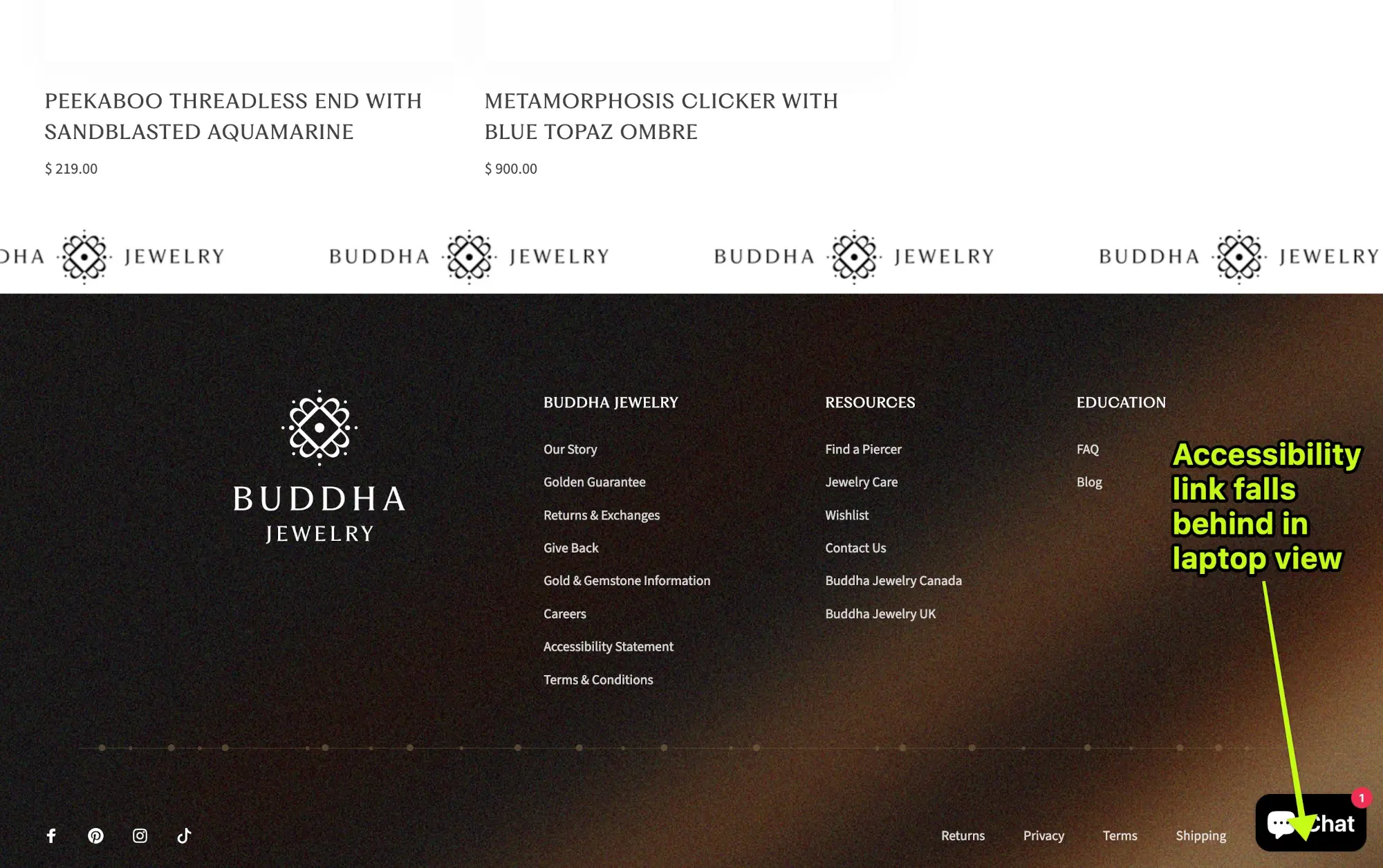
Clear the Overhanging Branches - WCAG 2.2: Focus Not Obscured
Don't let an overgrown bush block the garden path. A keyboard user navigating your site by pressing the Tab key needs to see exactly where they are stepping at all times. The Focus Not Obscured rule says that when an element receives keyboard focus, other content—like sticky headers, chat bubbles, or cookie banners—cannot physically sit on top of it, completely hiding the focus indicator.
This requirement is highly theme-dependent and requires a manual test. Put your mouse away and tab your way down the page to check your canopy and groundcover. If your focus ever moves behind another element on your page, it fails the test.
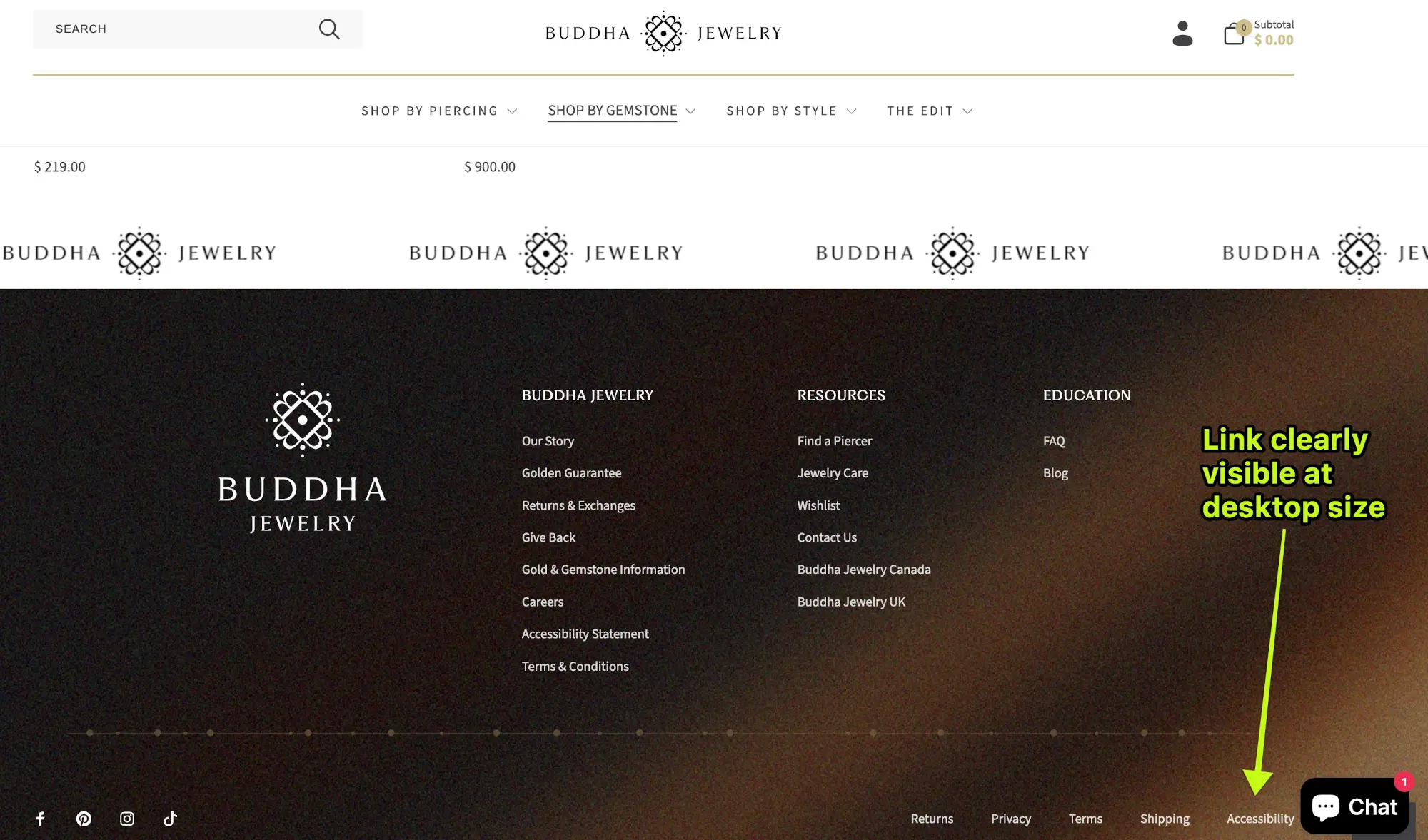
Watch the Canopy
Look at the top of your screen as you shift-tab backwards through your page. Does your pretty sticky header stick around and cover the focus ring of the links you are tabbing up to? If your links disappear under the header, theme developers need to add a bit of CSS magic called scroll-padding-top to fix this and keep the branches trimmed back.
Watch the Groundcover
Now tab back down to the bottom of the screen. Does that floating chat box hide links in your footer when it scrolls all the way down as you tab? Developers can fix this by adding extra whitespace padding to the bottom of the footer container so your links stop safely above the chat widget.
/* Create the invisible forcefields for the browser's scroll focus */
html {
/* Protects the canopy from a 150px sticky header (alter number of pixels for your particular header) */
scroll-padding-top: 150px;
/* Protects the groundcover from a 200px chat widget, or adjust to take into account extra space between your floating widget and the bottom of your page */
scroll-padding-bottom: 200px;
}
/* Add physical whitespace to the bottom of the page */
footer {
/* Ensures the absolute lowest links in the footer have enough room
to be scrolled up and over the 200px chat widget */
padding-bottom: 220px;
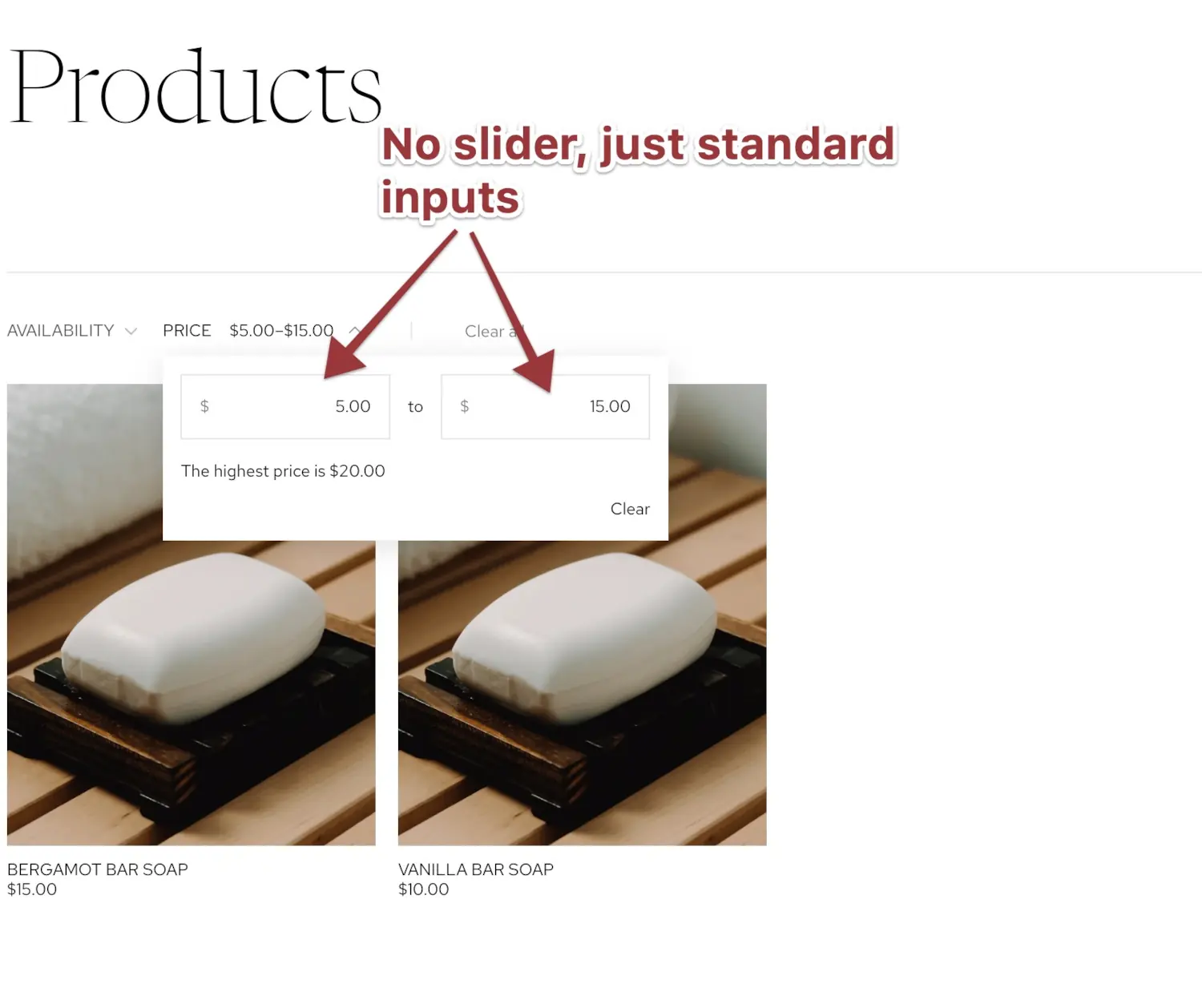
}Ditch the Heavy Wheelbarrow - WCAG 2.2: Dragging Movements
Don't require visitors to drag heavy bags of fertilizer just to see your flowers. Some people lack the fine motor skills, strength, or coordination to hold down a mouse button while dragging it across a screen. The Dragging Movements rule states that any feature requiring a drag must also be achievable with a simple, single click or tap.
You need to manually verify that every interactive feature in your theme has a single-click or text-based alternative. There are several common offenders in Shopify stores that you should weed out.
Price Range Sliders
Those sidebar filters that require dragging two handles to set a minimum and maximum price are a major hurdle. The fix is simple: add simple text input boxes next to the slider so users can just type their desired price range, or ditch the slider altogether and just go with inputs for the low and high price of the range.
Product Image Carousels
Because carousels are really only good for hiding content anyhow, we strongly recommend you replace product carousels with static product grids. If you legitimately can't do that, know this: Product galleries that force you to swipe or click-and-grab to scroll to the next product photo fail the Dragging Movements test. You must add visible Next and Previous arrow buttons so users can click their way through the gallery, even though research going back over a decade has shown that statistically very few people will look at anything but the first.
Horizontal Overflow Lists
Lists that overflow off the left and right side of the screen are incredibly frustrating, like a Shop by Category row that requires a click-and-drag scroll. You should add arrows to the sides of these, or better yet, just wrap the list onto a second line so it is entirely visible. A static section, as a baseline, beats anything that looks or works like a slider.
Before/After Image Sliders
If you use a widget where a user drags a central vertical line to see a before-and-after photo, ensure that clicking anywhere on the image instantly jumps the slider line to that exact spot. Dragging cannot be the only way to move it. In fact, the ideal interacton for a widget of this kind would be to allow users to tab to the dividing line, and then change its position with the left or right arrow keys so a single press would move the line perhaps 20% to the side. If that's a feature you want, you should test out with your keyboard themes and apps that have it, and go with the one that works best for all visitors. A competent web agency could help you add that ability to a theme with such a component, but likely wouldn't be able to help if the feature comes from an app, so testing is important.
Don't size your garden for fairies - WCAG 2.2: Target Size
Make the stepping stones in your garden big enough to actually step on. If you're using single bricks as stepping stones, your users are going to miss them entirely. The Target Size rule requires interactive elements, like links and buttons, to be at least 24 by 24 CSS pixels in size, including their padding. Small targets are terrible for anyone with tremors, anyone with arthritis, or anyone who is simply browsing your mobile site on a bumpy bus ride.
Your main checkout buttons are usually fine, but you need to check your smaller elements. Often, the tiny down-arrow carat that opens a dropdown menu is too small, requiring a developer to add CSS padding to the clickable area. You should also check those little social media circles for Instagram or Facebook in your footer, as well as tiny color swatches in product pages, and small pagination numbers at the bottom of collection pages.
There is a slight loophole here. If you have smaller targets, your site is still technically compliant if there is enough whitespace between them to prevent accidental clicks or taps. Just giving those elements a little extra padding or margin is usually the easiest way to make your garden accessible to everyone.
Opening the Garden Gate - WCAG 2.2: Accessible Authentication
Don't make people solve a complex riddle just to open the gate. The Accessible Authentication rule states that users shouldn’t be forced to pass a cognitive function test to log in. This includes things that require memory, like a password field without paste functionality, or solving complex puzzles.
Native Shopify logins manage this by default. Users can rely on their password managers, or use Shopify's six-digit email codes which allow for simple copy and paste. You only ruin this if you actively disable the paste function in your password fields, which in this case too is more work than letting it be.
The real weeds here are third-party CAPTCHAs. If you install an app that makes users solve math problems to login, it is a strict violation. And while standard object recognition CAPTCHAs—like clicking all the crosswalks—are technically still allowed under this specific accessibility standard, they are universal conversion-killers. There's a Moz article about this, and the title says it all: "Having a CAPTCHA is Killing Your Conversion Rate".
It's no wonder why this happens: the study from Stanford that Moz cites found that 29% of humans failed the CAPTCHA the first time around. Making your potential customers feel like failures isn't likely to encourage good will and a speedy checkout!
Stanford CAPTCHA Study: Human Failure Rates
— Stanford University (Analysis of 318,000+ CAPTCHAs)
Regular users absolutely hate doing free AI-training labor just to buy a t-shirt. The better solution is to use invisible netting. Tools like Google reCAPTCHA v3 or Cloudflare Turnstile can analyze user behavior in the background to block bots without ever annoying your actual human customers.
The Harvest: Reaping the Rewards of Compliance
The great news about Shopify is that the native platform provides great soil. Out of the bag, the core checkout and customer accounts organically support most of these six new requirements. The danger lies in the exotic cross-pollination we all do, specifically when installing third-party apps and custom widgets.
Apps are notorious for growing wild and creeping over the accessible pathways you worked so hard to clear. You need to walk the rows of your digital garden and check every new feature you’ve planted. If your third-party add-ons are overgrowing the 2.2 guidelines, reach out to the app developers and ask them to prune their code.
If they don't have a fix, ask them for recommended workarounds, or have your own web developers grab some shears and graft a custom solution for you. These fixes can often be done fairly quickly.
Taking the time for this spring planting puts you seasons ahead of the accessibility curve. It wards off the blight of litigation, improves the experience for all your users, and ensures your digital storefront will be blooming beautifully when the 2.2 standards eventually become the strict law of the land. Happy planting!
Spring-planting checklist
Six new WCAG 2.2 requirements to cultivate in your Shopify store
Seed 1
Any help you offer visitors — chat, FAQ, contact link — must use a consistent appearance, wording, and location on every page.
Consistent HelpSeed 2
Never require your visitors to repeat information they've already given you within the same session.
Redundant EntrySeed 3
Make sure nothing — sticky headers, chat bubbles, cookie banners — blocks the keyboard focus indicator as you tab down and back up the page.
Focus Not ObscuredSeed 4
Any component designed for dragging — sliders, carousels, before/after widgets — needs a single-click or keyboard alternative.
Dragging MovementsSeed 5
Everything interactive on your site should be at least 24×24 CSS pixels — big enough for everyone to reliably tap or click.
Target SizeSeed 6
Don't force users to solve cognitive puzzles to log in. Allow password pasting, and avoid math or object-recognition CAPTCHAs.
Accessible Authentication