
So a guy walks into an ER room and his arm’s falling off. “Hey Doc!” he says, “Can you heal me?”
“Why certainly, young man,” says the doctor, peering at the wound, “I’ve got just the thing. Have you patched up in no time!” With confidence, the doctor reaches into his lab coat and draws out a bandaid.
Making a big show of going over the woundcare instructions about keeping it dry and letting the bandaid do its job, the doctor applies the bandaid, slaps the guy on the back, and tells him good luck as he ushers him out of the hospital with a $1500 bill for services in hand.

The doctor in this story would be laughed out of the hospital. He’d be sued for malpractice, lose his license, and never work as a doctor in this town again! And yet, in today’s digital spaces, website owners right and left listen to the advice of quack web doctors and reach for their recommended overlay-widget bandaids, thinking they’re doing well.
In reality, however, most accessibility overlays do less to solve a website’s accessibility problems than the bandaid in this story. While most bandaids do actually aid in healing and decrease the tissue repair timeline, accessibility widgets just end up putting off any real movement towards remediation and prolonging the condition of inaccessibility.
What is an Accessibility Overlay?
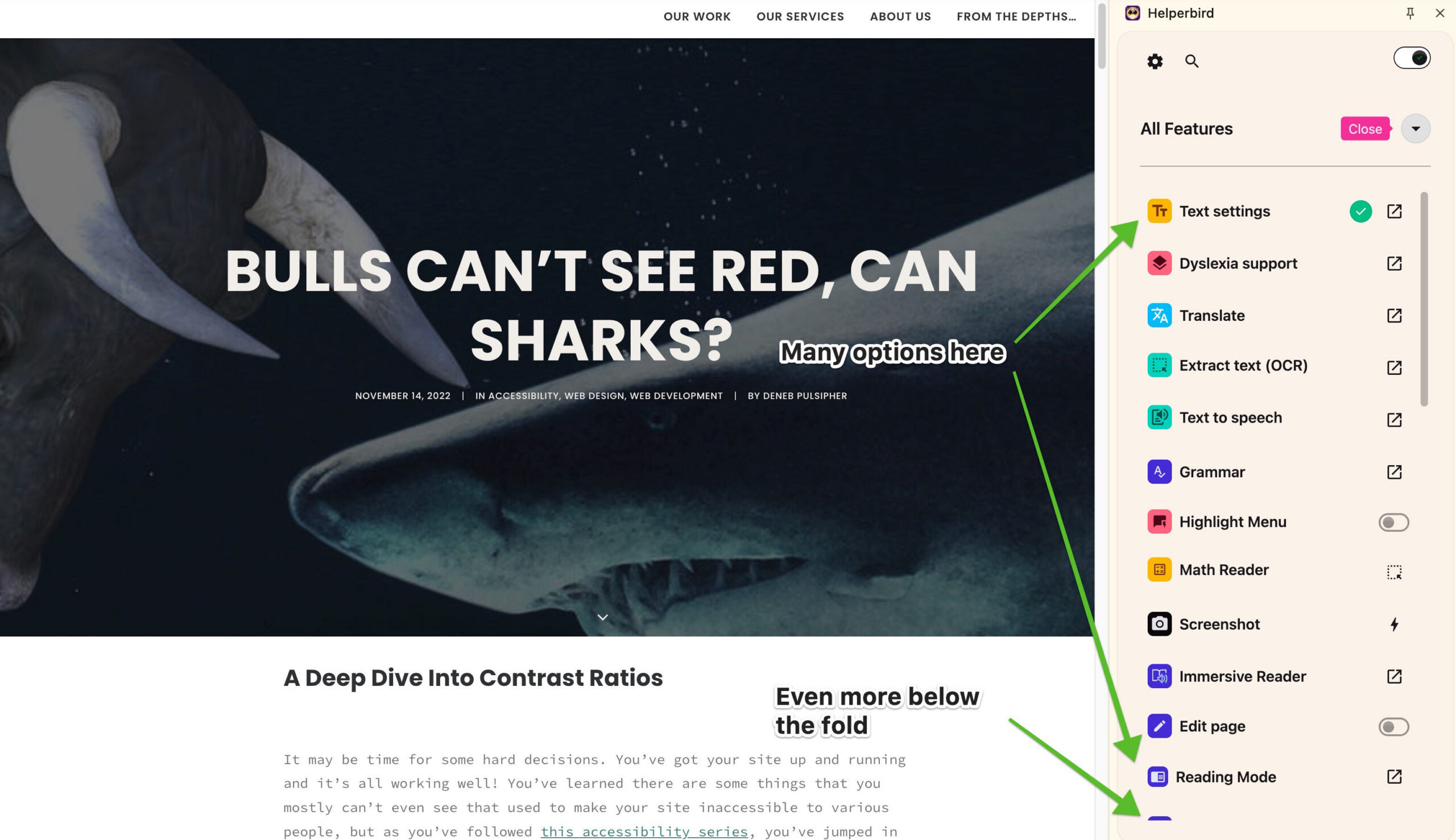
![]() An accessibility overlay, or sometimes called an “accessibility widget,” is indicated by one of those little buttons floating on a website with some icon representing accessibility. Often it’s the simplified Vitruvian man, but I’ve also seen it as a wheelchair, or even a square of four icons, variously an ear, an eye, a couple T’s of different sizes, maybe a hand.
An accessibility overlay, or sometimes called an “accessibility widget,” is indicated by one of those little buttons floating on a website with some icon representing accessibility. Often it’s the simplified Vitruvian man, but I’ve also seen it as a wheelchair, or even a square of four icons, variously an ear, an eye, a couple T’s of different sizes, maybe a hand.
All of these icons are meant to convey the message that clicking the floater will enable accessibility enhancement to the site.
When you click the floater, a panel pops up with several options for making the site easier to use for people with a variety of disabilities. It may allow turning on high-contrast mode, increased font sizing, toggling images on or off, and sometimes a half-dozen other possibilities…
On the face of it, these seem like helpful options for people with a variety of different conditions with which they may find it helpful to change the appearance of the site in some of the indicated ways. To a person without any of the conditions targeted by these options, the fact that there are options may give them a favorable impression of the site. After all, don’t these options indicate that the website owners are wanting to give to their visitors a way to make the website easier for them to digest?
The Intent vs The Reality
The simple answer is that yes, adding an overlay does indicate that the website owners want to do right for their visitors and help them in their challenges to access the site. It’s wonderful that website owners feel that way and have those desires. However, while the intent is to patch a 'skinned knee,' the reality is often closer to the malpractice in our ER story.
According to overlayfactsheet.org, an online petition signed by a thousand accessibility experts and users of assistive technology, accessibility overlays don't help at all, and often make the website even worse for users of assistive technology. Let’s examine why.
The Promise vs. The Function
Up until fairly recently, overlays just provided several tools to customize a few different aspects of how the website looked. Often these were simple changes like making the text larger, increasing the line height, or making sure it was really obvious what were links.
As time moved on, however, the customization tools became increasingly complex, adding reading rulers, text-to-speech engines, and other things that require more layers and javascript to work.
It’s not uncommon now for overlays to have dozens of options for customization. With all the added complexity, overlays often get in their own way and not only fail to accomplish their purpose but indeed hurt their own cause.
All of these options are aimed at giving website visitors a more customizable experience through the use of the overlay and its page-changing technology. The first problem this causes for one-off accessibility widgets is that it would take significant effort for visitors to work through all the options offered by the overlay.
Even if they do find and finesse the options that actually help them, the overlay, and all the work the visitor did to figure out how to use it is a solution for a single site.
As we’ve pointed out in a couple blog posts from years past (Shadow Puppets, and Don’t let Overload Sink Your Boat), most visitors are only inclined to dwell on any site for an average of a few minutes, max, and often just a single minute or less. We brought that up years ago, but it’s still the case these days, according to Umbrex, a website strategy consulting agency (Umbrex).
It doesn't make sense for most people with disabilities to take the time and put forth the effort to figure out the benefits of a complex tool on a single site, so most people with disabilities don't, according to the latest WebAIM survey of screen reader users.
Effectiveness of Web Accessibility Overlays
What’s an overlay actually do?
If most people who could benefit from the page changes offered by the overlay simply ignore it, it’s fine, isn't it? You offered, they ignored, no harm, no foul, right? Well, not quite.
Remember how I mentioned that overlays work by injecting different layers, styles, and javascript into the site to do their thing? Well, it turns out these layers aren’t completely benign. Sometimes they mess up the native solutions that some users depend on for every other site, like screen readers.
Chris Yoong, an accessibility developer blogger, points out that the official Germany website testing organization refuses to even test sites with overlays for just this reason.
In that case, in trying to help, you’re actually hurting. In trying to add convenience, you’re actually making site perusal much less convenient if not outright impossible.
I remember one time I was testing a site with a screen reader, and the site’s overlay added a screen-reader-only message that the screen reader would announce every several moves, telling the keystroke to use to launch the overlay’s own text-to-speech engine to read the page to me.
In order to launch that engine, though, I’d have had to disable my actual screen reader or put up with competing messages being read to me. And though it could have read the page to me, in disabling my screen reader, I’d have lost a host of abilities that let screen reader users get an overview of the page very quickly.
I don't think that's a path that any screen reader user would take! And this was offered even before the overlay itself was launched.
It was an added layer, explaining some capabilities of an overlay that would never be used by the intended audience. It was a layer that just got in the way. This squares with the findings of a study published for the annual conference on accessibility by the Association for Computing Machinery, that overlays mostly just get in the way.
Issues Introduced by Overlays
What sort of people actually could be helped by an overlay?
Now, I don’t like to be reactionary, and I really don’t like when people paint in black and white and ignore all the delicious shades of grey that there are in the world. So far I’ve offered a pretty dismal view on what overlays do and their ability to actually help people.
There is another side of things, though. It’s slightly possible that overlays could be beneficial to certain groups of people.
The newly disabled
The first group of people who overlays may help are the newly or temporarily disabled. Let’s say someone suffered a traumatic accident, or caught some disease that suddenly decreased their visual acuity by 50%. Someone in this position might benefit from an overlay’s offer to increase text size, flip the site into dark mode, or use one of the other enhancements an overlay offers.
On the other hand, the five minutes spent figuring out all the options on the overlay to adjust the aspect of a single site might more efficiently be spent figuring out the browser settings and computer system settings that make the entire web more enjoyable rather than just the relatively few sites that sport an overlay.
I call this group the “newly disabled” because after a couple days or a week, it’s likely that most newly disabled people would have figured out how to use the browser and system settings to make things better for themselves. People don’t stay in the newly disabled group for very long, so adding something to your site to accommodate them at the expense of every other disabled group doesn’t make much sense.
The elderly
The second group of people who may actually benefit from overlays are the elderly. As Ken Nakata, a former Senior Trial Attorney with the U.S. Justice Department's Disability Rights Section, puts it, “Where overlays, I think, are useful are in the case of the aging population… Let’s face it, our grandparents are not likely to fire up a screen reader or fire up a screen magnifier, and if they could do it through this one little panel… it’s convenience.” (video at about the 39 minute mark)
The elderly are less likely to explore computer and browser settings to find accommodations for their failing vision, so if curiosity brings them to open the accessibility widget and they find a simple way to make a site easier for them to digest, it might be more convenient, as Ken says, and so they might use it. Now, that’s a pretty big might, and I’ll point out that I’ve never seen any research indicating this is so, but it’s a possibility, and so it should be mentioned.

In all, though, I don’t think those two potential use-cases mean it’s a good idea to put an accessibility widget on your site. Overlays just do too many things in an uncontrolled way that can mess up the accessibility of your site for everyone else.
The External Reality: Red Flags and Risk
If the previous sections haven’t made it clear, an overlay is a bright red flag to both people with disabilities who rely on assistive technology, and the lawyers who specialize in accessibility litigation. It’s the digital equivalent of a business with steps having a sign out front saying, "We don't have a permanet ramp for wheelchair visitors, but if you need one, just ring this bell and we'll come out and cobble one together for you." In the physical realm, that would be so illegal nobody would even try it.
To people with disabilities, the overlay is a bandaid that indicates there’s probably a gaping, bloody flesh wound festering under it, because the site owners probably haven’t done anything except put the bandaid on to fix things. They know their screen reader is likely to run into structural problems that the overlay's "remediation" has masked or made worse. Because of this, they’ll often avoid the site entirely.
To lawyers, the overlay is a smoking gun. It’s an admission that you were aware of your accessibility obligations but chose a solution that is legally fraught.
The Federal Trade Commission (FTC) made it explicitly clear last year in a ruling against one major overlay provider that they must not make any representation that their product can make any website WCAG compliant, or ensure continued automatic compliance (FTC Ruling on AccessiBe). That means the overlay company’s primary marketing claim (that you can buy compliance) is legally dubious.
If an accessibility lawsuit comes knocking, the presence of the overlay shows intent to comply, but the FTC ruling ultimately means it also shows failure to comply, if it’s the only thing done.
What should you do instead?
The reality is that there are no shortcuts to a truly accessible website. You must roll up your sleeves and perform the work, but it’s not as daunting as the overlay companies want you to believe. The best approach is a consistent, multi-pronged strategy that addresses the core code issues, rather than trying to cover them with a bandaid.
The first step is often the easiest: Use a checker. Accessible Web has a great tool for initial scans and setting up continuous monitoring, as I pointed out in Keep Your Eyes on the Prize. You need to set up a system for checking your site regularly so that you can fix issues as they arise, instead of waiting for a lawsuit or a complaint. Accessibility checkers can only identify a handful of issues, but it’s an important handful.
Next, you need to do the basics. This is the low-hanging fruit that helps everyone, as we’ve included regularly in our blog:
The recommendations
Tools to help you assess
- Drag the
Spyglass Contrast Checker
bookmarklet (this very link) to your bookmarks bar and activate it for a tool to easily check and come up with fixes for text color contrast on your site.

- Use the Images Bookmarklet by Paul J Adam (install the same way) to your bookmarks bar and activate it to easily read the alt text of your images.

- Use your keyboard tab key to move through your menu and the enter key to activate each link to verify you can get to them all that way.
Doing these things will take some time, but really not that much time once you know what you need to do.
The February Accessibility Challenge
February is Low Vision Awareness Month. Instead of reaching for a band-aid, follow this 4-week plan to actually heal your site:
- Week 1: Color Contrast. Read Bulls Can’t See Red, Can Sharks?, then use the Spyglass Contrast Checker for 10 minutes a day to find and fix low-contrast text. Have your devs fix any problems.
- Week 2: Image Alt Text. Read Seeing is Believing 3 and use the Images Bookmarklet to audit the alt text of your images. Send updates to your web devs or do it yourself.
- Week 3: Navigation & Menus. Read Walk the Plank. Put your mouse away and try to navigate your entire menu using only the Tab and Enter keys. Fill out a ticket for your web agency to fix it if you can't.
- Week 4: Accountability. Read Swimming With the Fish and update your Accessibility Statement to ensure it's personable and provides a direct, human line of communication.
By March, you’ll have done more for your users than any overlay bandaid ever could. And if you’re currently using one, rip it off! Expose the wound to light and air, and do the work to make sure it truly heals.