
Accessibility is essential for every shop. Store owners should focus on common Shopify accessibility issues and practical steps to ensure their shops are usable by everyone, whatever their abilities.
An Accessible Shop
If you've chosen Shopify as your ecommerce platform, we congratulate you. You may remember how we concluded in our Ecommerce Cage Match that as a purpose-built ecommerce platform, Shopify knocks the contenders out of the ring, and how in Big Picture 1 we mentioned not only that Shopify can be accessible, but also that it's got an internal guide to help you make it so.
In recent years Shopify has also done quite a bit to ensure that it's accessible as a platform, and that its theme developers consider accessibility when they're building their themes. But like any good shopkeeper, you'll still want to walk through your shop carefully to make sure there aren't any accessibility spills, and if there are, you'll want to pull out your mop and clean them up. Let's mop the shop!
Common Shopify accessibility spills
General Shopify Accessibility Checklist
- Store has accessibility statement
- Store has an accessibility log
- Menu is fully accessible
- Text colors have high enough contrast ratio with background
- Focus style is well designed and visually identifiable
- Multimedia is accessible and pausable
A Shopify store faces most of the same accessibility issues that any other site faces, so you should check out all the posts in our series on accessibility before jumping into this more Shopify-specific information. First of all, you should make sure you have an accessibility statement, as well as a log of your efforts to make it accessible.
Check to see if your menu is fully accessible, especially to visitors on screen readers and those who navigate by keyboard. In fact, you should make sure everything in your site can be navigated by keyboard.
Check to verify that any colors you use in text have sufficient contrast ratios with their backgrounds so as to be easily legible even to people with contrast sensitivity loss. Make sure your focus style is well designed to be visually identifiable, including with a sufficient contrast. Check to make sure your multimedia is accessible and pausable to visitors who want to minimize distractions.
Product Image Alt Text
Once you've looked into those things, it's time to consider accessibility in some ways that are specific to ecommerce sites, and to Shopify accessibility in particular. We'd recommend you start out by looking at your images. You may remember my general recommendations from Seeing Is Believing 3 about alternative text. Our Principles for writing effective alt text may need to be modified a little in the context of your shop.
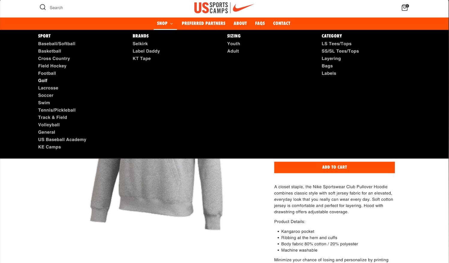
If you followed my earlier advice, your product images are likely descriptive of the product, which is good. On Shopify, and other ecommerce sites as well, however, those product images don't only serve to illustrate the product. In many locations in your shop, those images also serve as links to the products. Many themes today use the product title as the alt text for images that serve as links to the product, but not all do, particularly themes from several years ago. Such themes may use just the alt text that you set on the image.
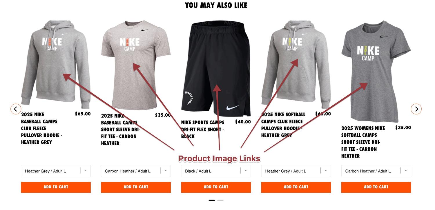
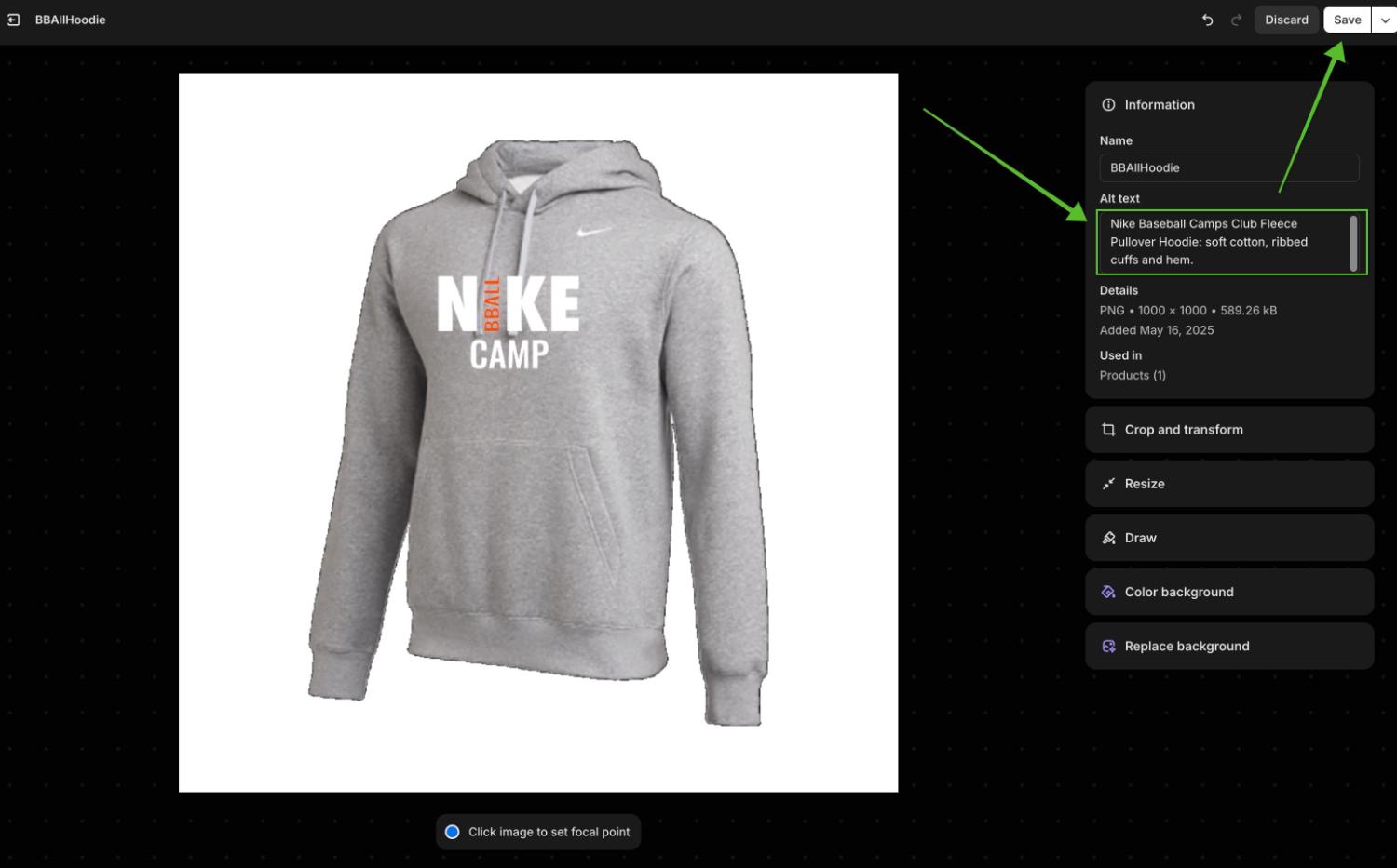
Because of this, a screen reader user on such themes will hear "Link, [alternative text]." If your alternative text for that nice fleece hoodie is, "Pullover hoodie sweatshirt with a kangaroo pouch and 'Nike Baseball Camps' printed on the front. The cuffs are ribbed, several inches wide, and hug the wearer's wrists warmly while the sleeves above them relax a bit to give optimal flexibility for the arms while also providing them a warm pocket of air. The bottom hem is also ribbed."
What a screen reader user will hear, then, will be, "Link, Pullover hoodie sweatshirt with a kangaroo pouch and 'Nike Baseball Camps' printed on the front. The cuffs are ribbed, several..." This would be problematic since the link goes to that particular product, whose name is never mentioned.
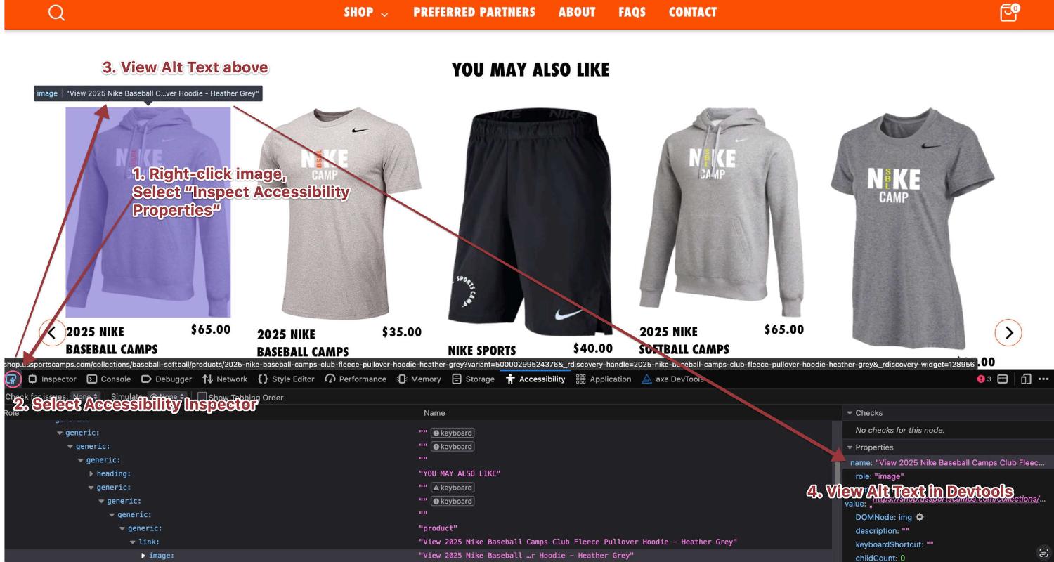
You can check what the alt text of your images are in Chrome by right-clicking on the image and choosing "Inspect Element". Next you'll click the Inspector tool in the Devtools, hovering over the image, and reading what it says in the Accessibility: Name section. The steps in Firefox and other browsers is pretty similar.
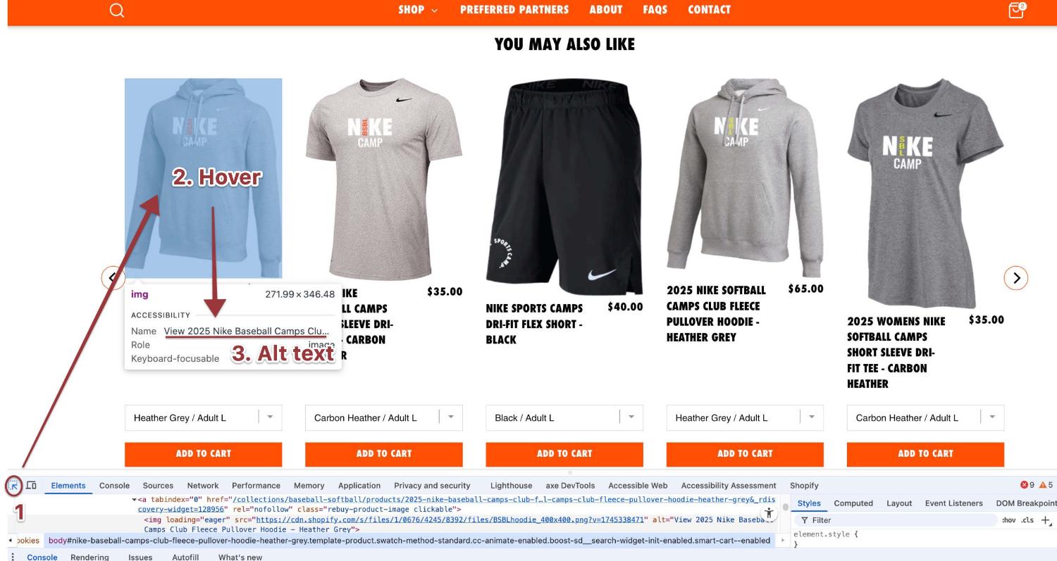
If you find that your theme uses the product name as the alt text, your store is fine in this regard. If, however, you find that your theme uses the alt text you set for the image, you may need to modify it to fit this use case. in addition to a somewhat limited description of the image itself, you should include as the very first word or words the name of the product. While the above was really too long for alternative text in the first place (remember, you're shooting for about 125 characters, or about 80% the maximum length of a standard text message), it also doesn't mention the name of the product that it links to.
Even if you make the alt text short enough to meet the requirements, when you neglect to include the name of the product right up front, you'll be contributing to possible confusion. Save longer descriptions for alternate images of the product that appear, for example, on the product page, while for the standard product image that is used in a link to the product, keep the descriptions brief, and start with the name of the product. Something like this would be fine:
Nike Baseball Camps Club Fleece Pullover Hoodie: soft cotton, ribbed cuffs and hem.
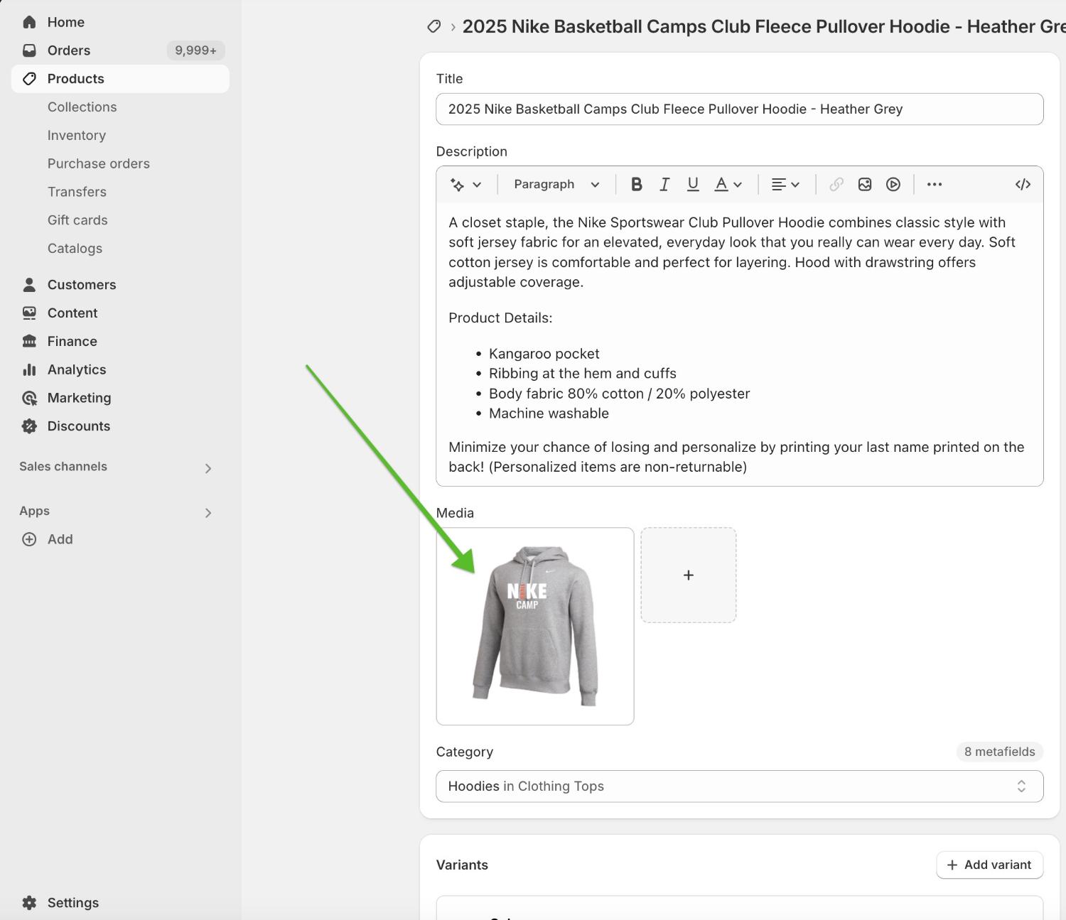
In Shopify, you modify the alt text of the image by finding it in the listing of your product in the Shopify admin, double clicking the image, and modifying the alt text in the popup.
Megamenus
In America, we're obsessed with choice. For good or ill, choice has become an end unto itself. If two choices are good, the reasoning goes, twenty are better.
There's actually quite a bit of research, though, indicating that the more-is-better reasoning isn't true, and that more choices actually make it less likely that people will buy and be satisfied with what they do buy. There are many chapters in Barry Schwartz's excellent book, The Paradox of Choice, illustrating this and related points, but I think one of the results of our erroneous reasoning is the proliferation of megamenus.
I would define a megamenu as any menu that has more than about fifteen menu items that pop up all at once. Some menus in the wild have twice that, or more. I think part of the reason for megamenus' popularity is our more-is-better credo, where listing all the options in the shop gets all the options out front where more intuitively feels better.
In addition to the dubious nature of the more-is-better mentality, adding a megamenu to your site or store also has potential Shopify accessibility ramifications. Megamenus increase cognitive load for visitors, which we discussed in "Don't Let Overload Sink Your Boat", I've seen many megamenus that don't work with keyboard navigation, have confusing structures, or won't even drop down for screen-reader and keyboard visitors.
If your site does have a megamenu, I'd encourage you to consider first whether it's accessible at all (perhaps using Walk the Plank as a guide), and second whether having a megamenu actually advances your goals of increasing conversions, or whether it might be getting in the way. I'll end my discussion of Megamenus with a quote from a blog post called "Mega Menus are Mega Awful".
AJ Kohn from BlindFiveYearOld says this:
Mega menus are often difficult to use, shift the burden of navigation to the user, reduce or eliminate editorial expertise, hamstring marketers and create SEO headaches. The road to hell is paved with good intentions. Mega menus mean well but usually wind up doing more harm than good."
As long as your megamenu is accessible, you can keep it, but you might want to take some time anyhow to consider whether you should keep it. If your megamenu isn't accessible, the good news is that most default simple menus in Shopify are indeed accessible these days. Shopify's default theme, Dawn, has a fully accessible menu, and so does any theme that is built on it. Add a megamenu to your theme via app or even one of your theme's options, and the accessibility might go out the window. You'll need to check the theme or app to be sure.
Apps
Speaking of apps, you should get into the habit of thoroughly testing for accessibility in the various components that apps add to your store, preferably before even adding them to your live store where they may prove detrimental to your Shopify accessibility.
Serious app issues
Sometimes apps may introduce really serious accessibility issues. For example, I recently ran into an app that replaced the theme's native fly-out cart with one that didn't capture keyboard focus. This meant that someone navigating by keyboard would need to tab through every element on the page before finally arriving at the cart in order to modify it and check out.
I ran into another that used the native cart that did capture focus. The widget that it inserted into the cart, however, would capture keyboard focus as users tabbed into it, and not release their focus to continue on to the checkout button. This consequently blocked keyboarding visitors from being able to actually buy what they'd put in their cart.
For apps in your store that introduce serious accessibility issues that can't be remediated, you should search for an alternative with a similar functionality that doesn't have the accessibility problem.
Less serious issues: Color
Other apps introduce less serious accessibility issues, but ones that should be fixed nonetheless. One of the most common problems introduced by apps are color contrast issues. Remember that the standard for the color contrast of text against its background is a ratio of 4.5:1. Often apps will opt for brighter, flashier colors for their labels or other visual components that may not meet that standard.
How to check for color contrast violations
There are many tools to use to check for color contrast violations, but increasingly (particularly for individual elements) I turn to the built-in tools of two ubiquitous browsers: Chrome and Firefox.
Chrome
To check the contrast of an element on the page against its single-color background, in Chrome just right-click the item (or anywhere on screen), choose Inspect, click the inspector button, and hover over the element in question to see its contrast ratio, along with whether it passes (green check) or fails (red exclamation mark) a contrast check.
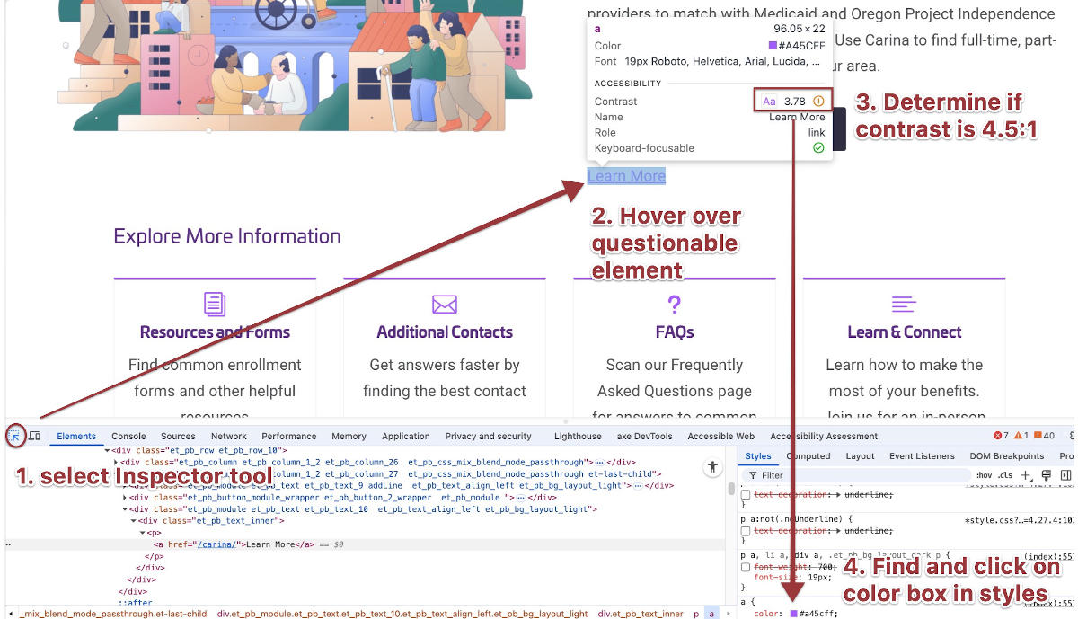
Chrome is a particularly helpful tool to use with color contrast issues, as when you click the offending item, you can click the color in the style panel, then choose what ratio you'd like the color to meet, and it'll darken or lighten it to the closest passing color.
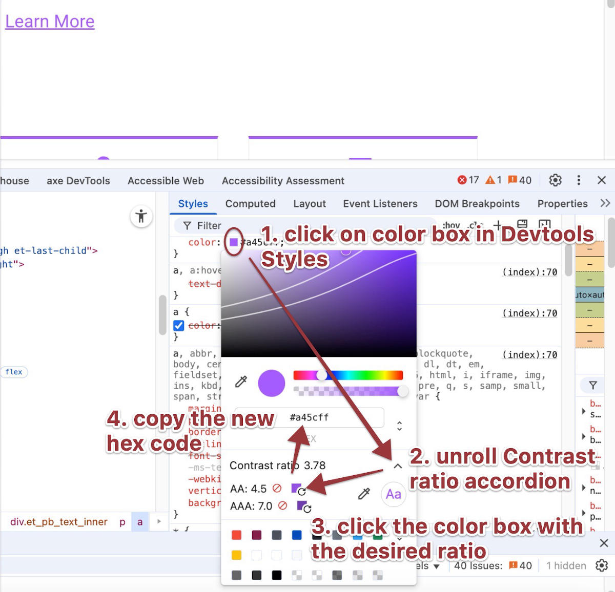
Then you can copy the hex code for it to use in your stylesheet to modify that color. Sometimes you don't even have to go to your stylesheet to modify such colors as there may be controls in the app do to it there. But you should do it, or have your dev agency do it for you.
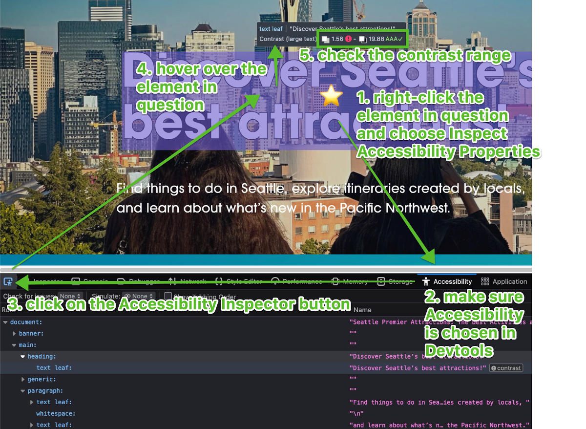
Firefox
Similar to Chrome, but with an added step, in Firefox, right-click the item and choose Inspect Accessibility Properties. Instead of clicking the Inspector button, now you'll click the Accessibility Inspector button and hover over the element in question. Firefox doesn't have the option to fix the color, but it has the added benefit of being able to check the contrast of text that's on top of multiple background colors or an image and give you the range of contrasts.
Checkout
The last accessibility issue I want to highlight that often plagues ecommerce sites is an inaccessible checkout experience. I already previewed this problem in the last section on apps when I mentioned the apps I've run into that hijack the cart and make it inaccessible.
It's less common that the native cart in a theme will introduce similar accessibility challenges, but not unheard of. It's always a good idea to perform some keyboard and screen reader testing to verify that the checkout experience is possible, and as simple as can be.
Think how frustrating it would be for people dependent on assistive devices like keyboards for navigation, or screen readers, if after spending all the time to evaluate their choices and add them to their carts, they find out they can't actually check out. Some research from Nielsen has found that people with disabilities, who are otherwise very loyal, are prone to abandon ship when slighted.
Review the Checkout with both keyboard and screen reader
Once you master the simple steps of keyboard testing, it should only take two minutes to make sure your checkout experience is accessible by keyboard. After learning the basics of screen reader testing, it should only take you three minutes to make sure your checkout experience is accessible to screen reader users. Thus, in five minutes of testing you can make sure that this last, most essential step of your customers' journey is available to all your customers, no matter which assistive technology they depend on.
Questions to ask when keyboard or screen-reader testing checkout
- If the add to cart button opens the cart, does it send your keyboard or screen reader focus to the cart?
- Does the cart button in your header open a separate page or open a popup cart of some sort, and if the latter, does it move your keyboard or screen reader focus into it?
- Are you able to modify the cart with just your keyboard or screen reader? Can you increase or decrease the quantity of items?
- Are you able to get to and activate the Checkout button with your keyboard or screen reader?
If the answer to any of these questions is "No", you need to ask your web dev agency to fix the problems for you, or figure out how to fix them yourself. In fact, that standard is true for really anything I've mentioned in this post. It can be good to be a self-starter, and of course I encourage everyone to think about accessibility issues, but sometimes it's just best to have an expert fix things up for you.
Closing Time
Knowing is half the battle, and now you know so you can at least clearly articulate what you want your dev agency to do to fix the site: Make sure your alt text is appropriate in all the changing contexts of where an image is used, make sure the menu is as simple and accessible as can be, make sure the apps aren't bringing in accessibility issues and fix the ones they do, and make sure the checkout experience is possible and easy with both keyboard and screen reader navigation.
Nobody wants a sloppy shop. Doing a thorough walkthrough of your Shopify site checking for these specific Shopify accessibility spills will give you the chance to take a mop to them and clean them up before someone who's dependent on assistive technology slips.