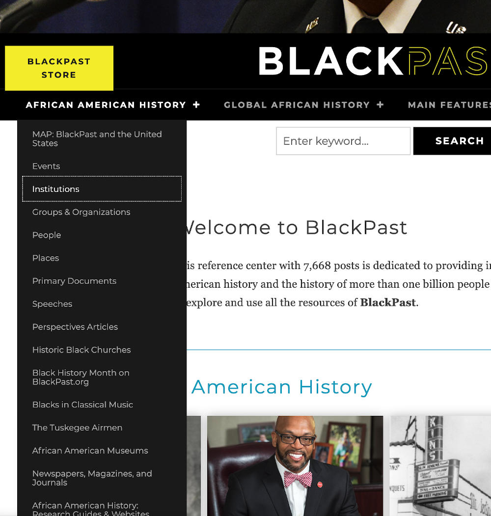
Our accessibility series to this point has explored some generalities of website accessibility, but now let’s get into some of the nuts and bolts of one of the most common things I see that make sites less accommodating to users of assistive technologies: inaccessible navigation menus. This may not be anything you’ve even considered in connection with your website. It’s like the gangplank of your ship: you didn’t build it, it was there when you first stepped on board. You didn’t have to come up with any content for it, quick and dirty, or otherwise. You told your dev team what pages you have, the menu was generated automatically from that, and just works, right? Well, yes it probably was automatically generated, and yes it’s supposed to work, and probably does for the majority of your users. But for the twenty percent we’ve been talking about in this series—the twenty percent who could benefit from a little accommodation—it may not just work, and may feel to them like you’re making them walk the plank.


Here’s the problem: When someone is navigating your site through their keyboard tab and enter keys, or on an assistive device, they’ll probably be able to go through the top level of your menu, and select any of those links: your primary menu items. But if any of your menu items drops down, it’s kind of a dice roll as to whether or not a visitor can tab into your dropdown menus, so quite often all of those secondary menu items are unavailable to people on assistive technologies. They’re inaccessible to those people, which means that in the final analysis, your menu isn’t accessible like you assumed it was.
This may not be any fault of yours, or even of the agency who built your site. The navigation was probably built in by default to whatever theme or template used for your site, and accessibility should be built into all of those, so it shouldn’t be something you have to check, but it’s not always built in, so you do have to check. And the sad fact of the matter is that when you check, I’d guess there’s a thirty- to forty-percent chance that you’ll find that your menu is indeed inaccessible. Blast.
Put it to the test
So how do you perform this check? Let’s get it over with. Okay. Navigate to your site in your favorite browser. Then right after it loads, hit the tab key. If you’ve implemented our suggestion to set a bold focus style, you’ll see the outline of the first element of your page that you can interact with. If you’ve implemented our skip-link recommendation, this will likely be a newly-visible link that offers to let you skip past the navigation. Keep tabbing because the navigation is where you’re trying to go.
Inside your navigation now, you’ll see the first menu item outlined. If it has no dropdown menu inside it, that’s all you’ll see. If it does have a dropdown, though, you’ll either see those items drop down, or you won’t, but if you hover your mouse over the item you’re focussed on, you will see them drop down. When you’re tabbing, though, you’ll have one of four experiences:
First Possibility
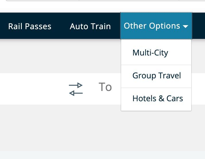
By hitting Enter on either the menu item itself or a dropdown indicator next to it, the menu drops down and then you can tab through it, or by hitting enter again you could collapse the dropdown and tab to the next primary menu item. This is the most accessible and helpful type of menu as it allows for an overview of the menu without needing to tab all the way through it.
Second Possibility
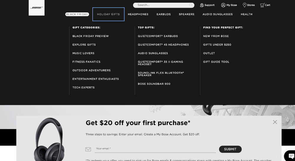
When you tab to the primary menu item with a dropdown, it drops down automatically and you can tab through and select anything in it. In this case, your menu is accessible, though you should be aware that if your dropdown menu has many items, it could take a while for someone navigating by keyboard or assistive technology to get through the options, and that this menu may not even have what the visitor is looking for.
Third Possibility
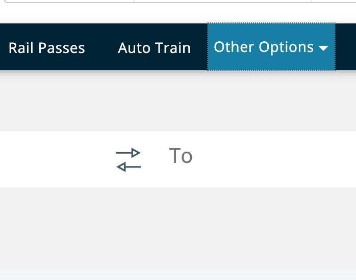
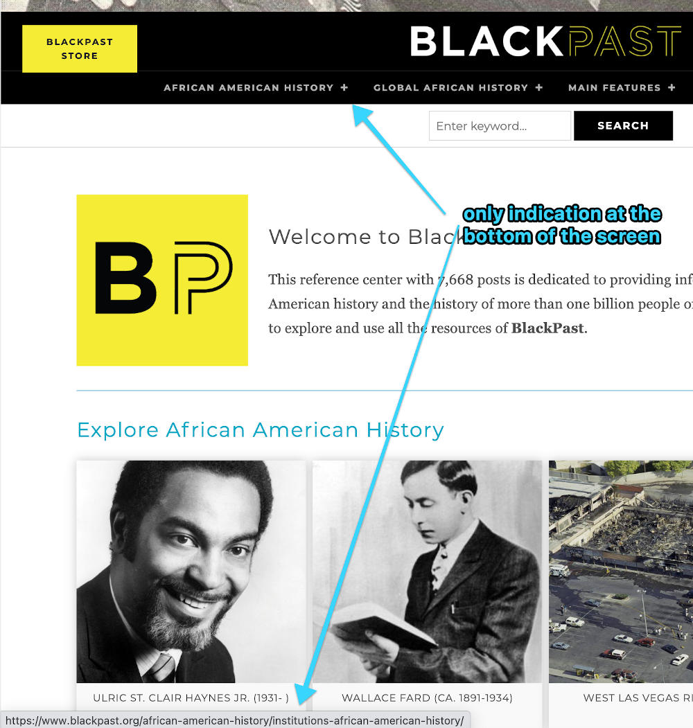
The menu item is outlined, but nothing drops down. Nevertheless, when you continue tabbing, you find by looking at the spot your browser displays the selected URL, that you are indeed tabbing through the menu and you could select any of the dropdown menu’s links even though you can’t see them. In this case, your menu is semi accessible, but very awkward.
Fourth Possibility
When you keep tabbing, it takes your focus outline to the next primary menu item despite the fact that you know there is a dropdown menu. In this case, your primary menu is accessible, but your secondary one is not.
What To Do?
Now that you know which type of menu you have, let’s discuss what it would take to make your menu more accessible and accommodating. If you have the first type of menu, you’re in luck! Your menu is very accessible and very accommodating to users of assistive technologies. I favor the kind of menu where you can tab into the dropdown indicator and hitting enter on that drops the menu down or retracts it. This is the type of menu where it’s most clearly evident how it should be navigated.
2: Auto
If your menu is like the second type (automatically dropping down), you’re okay, but you should be wary of including too many items in the secondary menu, as anyone using keyboard navigation or assistive technologies will have to go through each of these items to get to the other primary menu items. That’s probably okay if you only have four or five drop-down menu items total spread throughout your menu, but if you have extensive drop-down menu items, you should look to convert your menu to the first type I mentioned.
3: No-Drop
If your menu is like the third type (you tab through it, but it doesn’t drop down), I’d call it semi-accessible, but not very accommodating. It’s confusing to people navigating by keyboard who can see because although they could look at the corner of the screen where the browser announces what url is being selected, they can’t actually see their focus inside the menu. To fix this, often all that needs to be done is to apply the same positioning styles to :focus-within as to :hover. Drop-down menus can be built in a number of different ways, though, so you’d need to consider the code of how yours is built to determine whether this would work or not.
4: Inaccessible
If your menu is like the fourth type, it’s just not accessible, at least if it has drop-down menus. You could eliminate those items and then the menu would be fine, but you may need the complexity that the drop-downs include. In that case you have a couple of options. You could hire a reputable web development firm with experience in providing accessibility solutions to companies like yours. They could convert your inaccessible menu into ideally the first type I mentioned, and then you could have as many secondary items as you’d like. If you’re not quite ready for that step, though, there is something you could do to at least make the situation a little better.
If in each of the parent pages—the pages linked to by the first tier of menu items—you included a mini navigation menu, or even just a set of links, to the various subpages you include in the dropdown menu, then even though the menu itself isn’t accessible, at least your patrons have pretty quick access to those same items in a logical spot. This is kind of the bucket-under-a-leaky-roof approach. You know you’re going to have to fix it eventually, but in the meantime at least it’s not going to be rotting out your floor as well.
If you take this approach, and make mention of that fact in your Accessibility Statement, then your visitors who need it will appreciate that you’re working on it, and the lawyers looking for a fight will see that you’re being proactive and move on to other galleys rather than try to make you walk the plank. But please do work on it. Make a plan for how and when you will fix the accessibility of your menu so nobody feels like they have to walk the plank because of how your menu was set up.
Contact us for a consultation and we'll walk the plank with you to make sure your menu is accessible to all.
Read more in our Accessibility series
For cats without mice: Does your site work without a mouse?
April 9, 2025
Please test your website to make sure it works for keyboard navigation.
0 Comments1 Minute
Wes on Proactive Accessibility, Honest Ecommerce Podcast
September 17, 2024
Learn how to get ahead of the game on accessibility to protect yourself from lawsuits, and more importantly, to make sure all your visitors have a…
0 Comments57 Minutes
Bulls Can’t See Red, Can Sharks?
Web Design,Web Development,Accessibility
November 14, 2022
If the contrast ratios throughout your site are high enough, it’ll make it easy for all your visitors to have a great experience and want to come…
0 Comments16 Minutes
Swimming with the Fish: Accessibility Statements
October 15, 2021
You’ve worked to ensure your site is as accessible as possible; the next step is to add an accessibility statement to tell what you've done. Learn…
0 Comments6 Minutes
Sharks in the Water 3: Now See Here!
Web Design,Web Development,Accessibility
September 15, 2021
You’re looking a shark (lawyer) in the eye, trying to stare it down, but you’re struck by the irony that seeing is the whole problem in the first…
0 Comments9 Minutes
Keeping the Sharks at Bay Part 2: Don’t move!
Web Design,Web Development,Accessibility
August 19, 2021
The sharks are circling you, but the letter they sent you didn’t mention anything about auditory challenges, so our last installment of the series…
0 Comments8 Minutes
Keeping Sharks at Bay Part 1: Your Site’s for Everyone, You Hear?
Web Design,Web Development,Accessibility
May 28, 2021
By the end of this three-step process, you’ll have addressed the various issues you face. It’s impossible to instantaneously fix everything about…
0 Comments6 Minutes


