You’re looking a shark in the eye, trying to stare it down, but you’re struck by the irony that seeing is the whole problem in the first place. The lawsuit brought against you says that your website discriminates against blind folks. You’re flabbergasted! Your grandma’s blind, or mostly blind at any rate, and you’d never discriminate against her! What are they talking about?
Yes, but when is the last time your grandma rolled up to your site? And how did it go when she did? Or how would it go if she did? Maybe not so well, which means that though you don’t intend it, there are some aspects of it that discriminate against her, and all others who are blind, or have visual impairments.
Hopefully your granny has a screen reader, a program that reads the page to her and puts her well on the way to being able to enjoy much of the content on the web. But unfortunately, assistive technologies like screen readers are only as good as the sites they read. What do I mean by that? Well, the screen reader will read all of the text that you worked so hard to make powerful and surprising, authentic and fresh, as we discussed in Quick and Dirty 4. But without alternative text for the images, as we discussed in Seeing is Believing 3, their users are going to be missing out on a lot. So make sure you go back and add that alternative text to the images you so carefully selected. It’s not terribly hard, but it is vitally important if you want your site to be accessible to blind people.
For Cats Without Mice

If you’ve added alternative text for images, and proper headings and a skip navigation link like we explained in our previous post in this series, you’re on your way to full accessibility for the visually impaired. There’s another consideration that if missing may sink your visitor’s raft outright, though, and keep them from paddling around your lagoon almost at all, and that is the ability for a visitor to navigate your menu by using their keyboard.
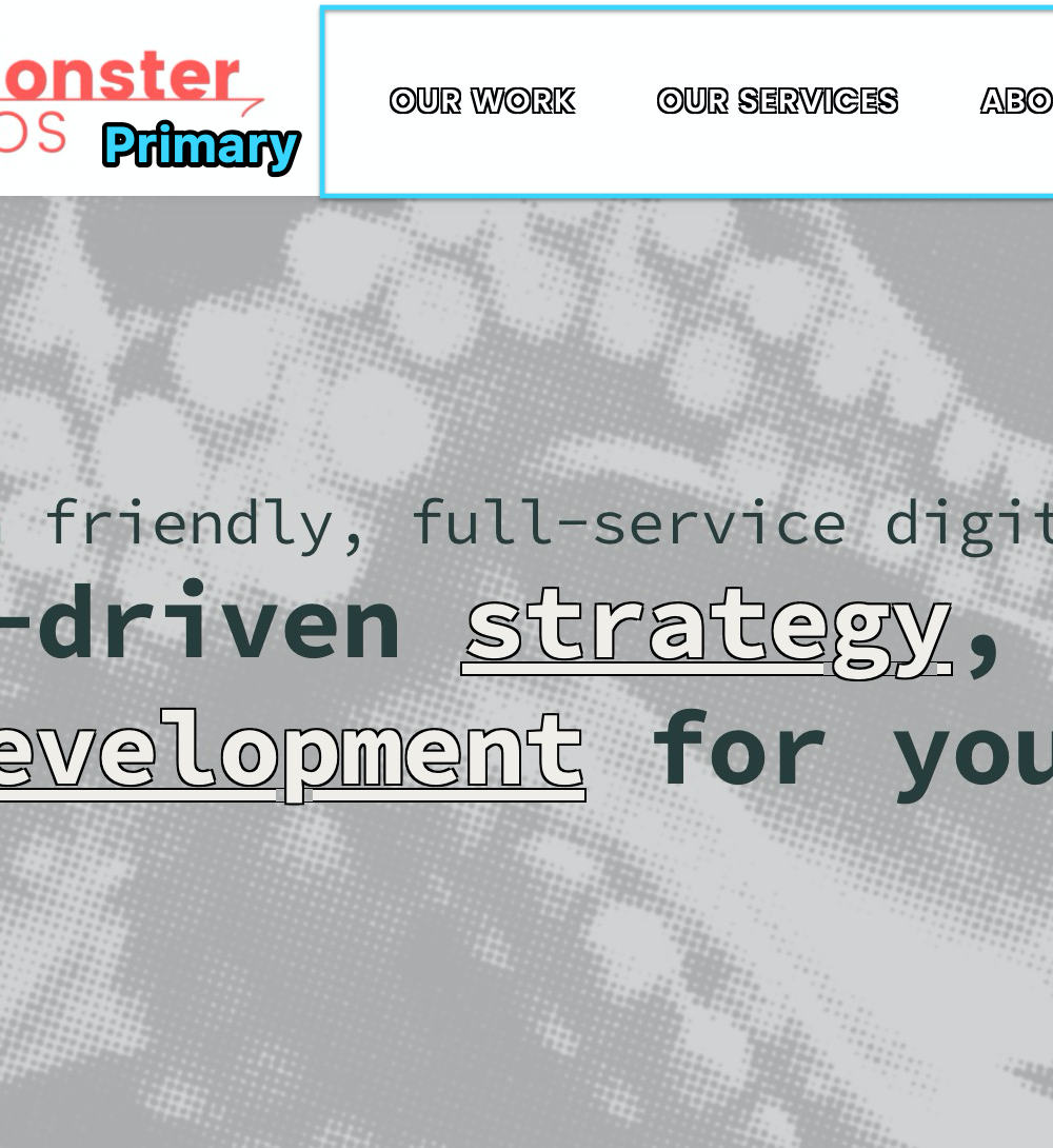
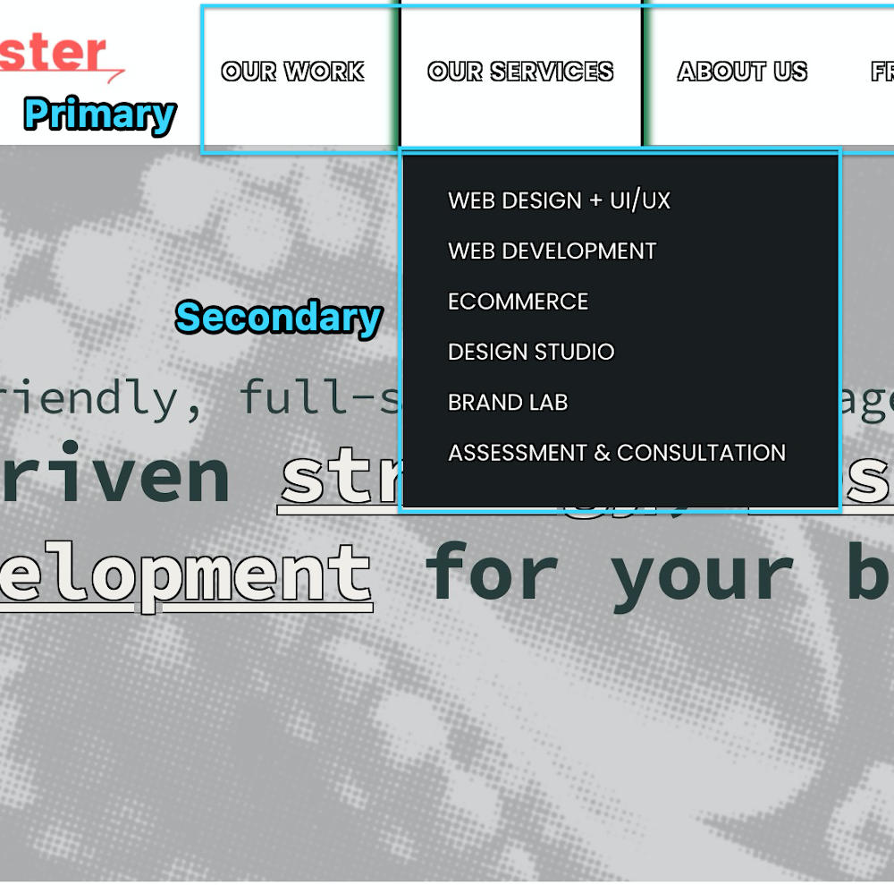
You see, many menus today are fantastic for sighted people: they slide, they flash, they drop down, they change colors. Unfortunately, blind visitors won’t get any of that, and in fact some of that may block them from being able to use the menu at all. Now, almost always the first level of the menu will be keyboard accessible. That is to say, what you can see of the menu without hovering over it with a mouse can usually be accessed with the keyboard tab and enter keys.


It starts getting tricky, though, with the secondary level, or what sighted visitors would easily understand as drop-down menus. Sometimes visitors who are navigating by keyboard (including both the blind and also the low-motion visitors that we talked about in our last post), won’t be able to access that second level. Sometimes the technologies that were used to build the menu didn’t have accessibility in mind, so they were built in a way that excludes keyboard navigators. This probably wasn’t the intention of whoever made the technology you used, and it certainly wasn’t your intention, but nevertheless several times out of ten the menu for the site will be incompatible with keyboard navigation, and therefore inaccessible.
Unfortunately, there’s no one-size-fits-all method for making every menu keyboard accessible, but any competent web development firm should be able to modify the code to make it so. A big part of this is making it so that when someone tabs into a drop-down menu, it also visually drops down. This will help the low-motion folks who would otherwise find that menu terribly confusing. Unfortunately, I’d guess that on top of the two or three out of ten menus that won’t even let you tab into their submenus, probably one or two that do won’t drop the menus down visually when you do tab into them. It’s probably not fifty percent of menus online that are inaccessible by keyboard, but it is a substantial number of them, and yours shouldn’t be among their ranks!
Now Just Try to Focus
While we’re making demands of your web development firm, here’s another easy one that you should make, not so much to help the blind visitors as the low-vision ones, and folks navigating by keyboard: make the focus indicator bold. The focus indicator is usually an outline that tells you what is selected when tabbing through a webpage. Most browsers have a default style for this, so visitors will get something even if you don’t define the styles yourself, but the browser defaults are inconsistent, not that attractive, and sometimes not even very helpful.
The thin dotted line that Firefox gives you, for example, isn’t all that apparent and you have to really be looking for it to even notice it. If you have to scour the page for the indicator while navigating with the keyboard, the indicator isn’t indicative enough! I recommend a two-toned outline (or actually a box-shadow) in a dark and a light brand color to make sure that it jumps out at you, whether the background is light or dark. Usually it’s one or two lines of code in your stylesheet, and it’s well worth it.
Default Browser Styles
Chrome
Firefox
Safari
Edge
SeaMonster Recommendation
Two-tone Box-shadow
Code for the stylesheet
There are a hundred other little things you can do to make sure your site is accessible, but I’d say the things we’ve been over in this series so far are the most essential, to wit:
- Make sure you make any sound you use on the site accessible by providing alternate descriptions for deaf people to read to get the same experience.
- Make sure your pages have the proper heading structure.
- Make sure you’ve got a skip-navigation link before the main navigation at the top of the page.
- Make sure all your images have alternative text for screen readers and other assistive technologies.
- Make sure your menus are accessible by using the keyboard tab key, and that when tabbing into a secondary menu, it is revealed just as if you hovered over it.
- Make sure your focus indicator is bold enough to be easily apparent to those who navigate by keyboard.
At the very least, these six steps will get you well on your way down the road to full WCAG compliance. The sharks will still be there in the water, but because of the three-pronged approach you’ve taken to addressing auditory, kinesthetic, and visual compliance considerations of your site, it’s more likely they’ll leave you alone.
Contact us for a consultation and we'll help you chase those sharks away. You bring your trident, and we'll bring our harpoons!
Read more in our Accessibility series
For cats without mice: Does your site work without a mouse?
April 9, 2025
Please test your website to make sure it works for keyboard navigation.
0 Comments1 Minute
Wes on Proactive Accessibility, Honest Ecommerce Podcast
September 17, 2024
Learn how to get ahead of the game on accessibility to protect yourself from lawsuits, and more importantly, to make sure all your visitors have a…
0 Comments57 Minutes
Bulls Can’t See Red, Can Sharks?
Web Design,Web Development,Accessibility
November 14, 2022
If the contrast ratios throughout your site are high enough, it’ll make it easy for all your visitors to have a great experience and want to come…
0 Comments16 Minutes
Swimming with the Fish: Accessibility Statements
October 15, 2021
You’ve worked to ensure your site is as accessible as possible; the next step is to add an accessibility statement to tell what you've done. Learn…
0 Comments6 Minutes
Keeping the Sharks at Bay Part 2: Don’t move!
Web Design,Web Development,Accessibility
August 19, 2021
The sharks are circling you, but the letter they sent you didn’t mention anything about auditory challenges, so our last installment of the series…
0 Comments8 Minutes
Keeping Sharks at Bay Part 1: Your Site’s for Everyone, You Hear?
Web Design,Web Development,Accessibility
May 28, 2021
By the end of this three-step process, you’ll have addressed the various issues you face. It’s impossible to instantaneously fix everything about…
0 Comments6 Minutes


